Chapters
- Редактор вмісту електронних листів Stripo із функцією перетягування
- Налаштування редактора електронних листів Stripo із функцією перетягування
- Налаштування вигляду редактора електронних листів Stripo
Contents
the email tool that makes email marketing simple

Налаштування редактора електронних листів Stripo із функцією перетягування
Published: · Last updated: · By Marcus Biel
In brief
Дізнайтеся, як у редакторі Stripo в Maildroppa налаштовувати макети, блоки, зображення, текст, кнопки, відео, посилання й HTML для листів.
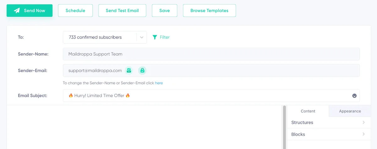
У правій частині редактора електронних листів Maildroppa ви знайдете колонку налаштувань електронного листа, яка містить інструменти для структурування й налаштування вмісту та вигляду вашого електронного листа. Ця колонка поділена на дві вкладки: Вміст і Вигляд.
Вкладка «Вміст»
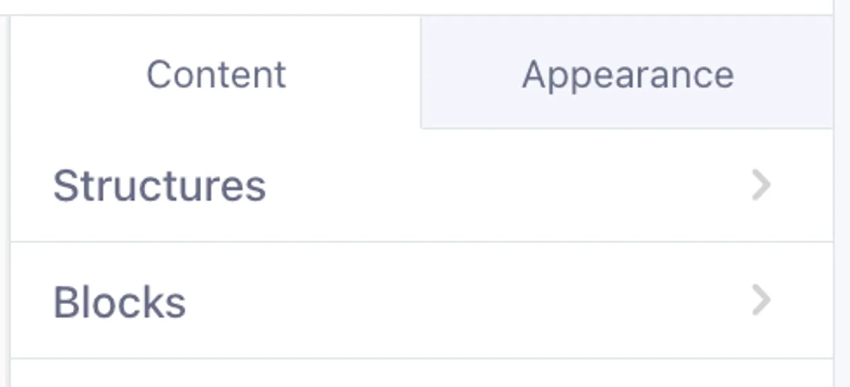
На вкладці Вміст ви створюєте й упорядковуєте вміст електронного листа. Вона містить два основні розділи: Структури та Блоки.
1. Структури
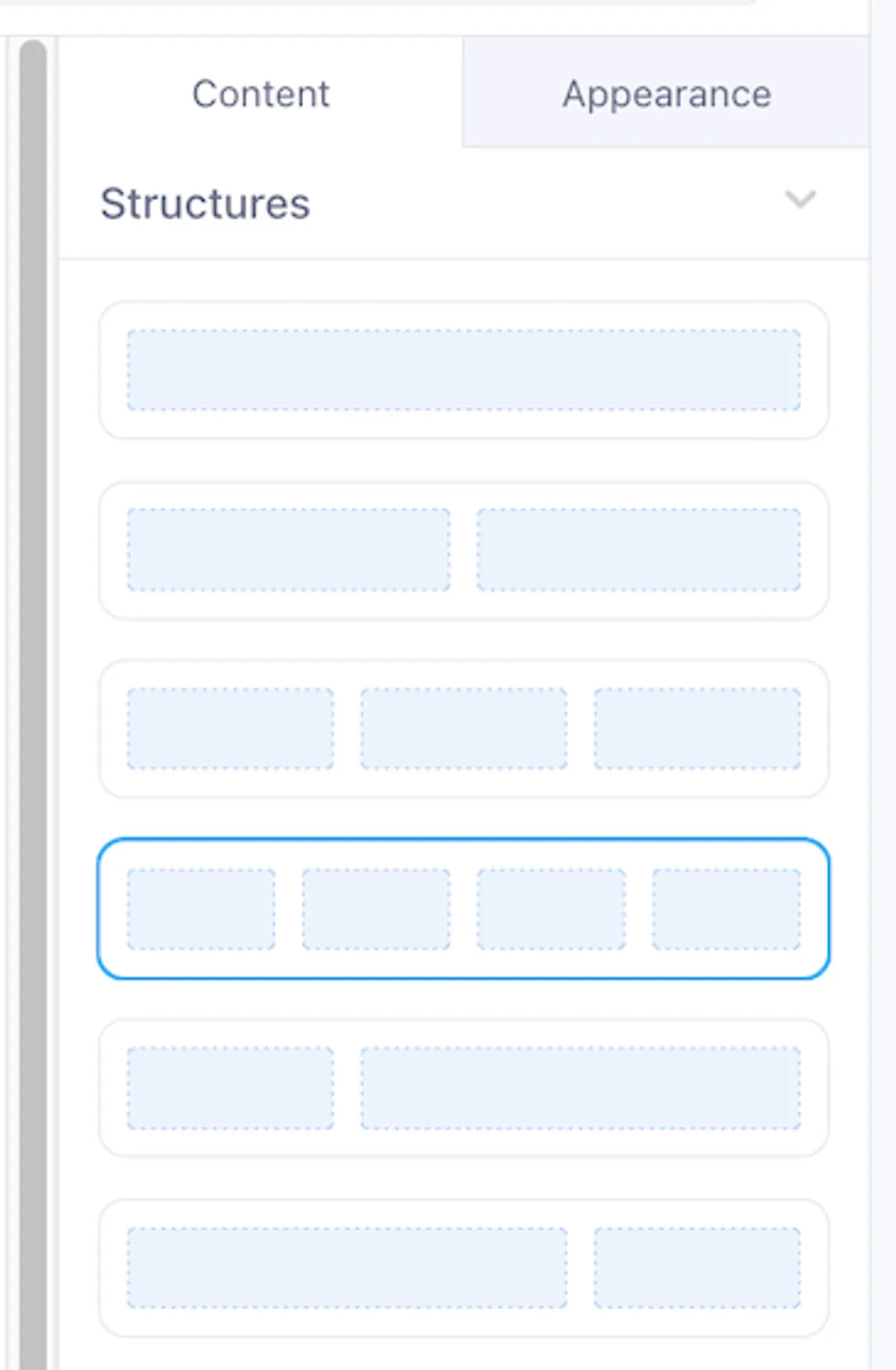
Структури визначають макет електронного листа, розміщуючи вміст у рядках і стовпцях. Ви можете вибрати один із готових макетів, наприклад:
- Одностовпцевий
- Двостовпцевий
- Багатостовпцевий
Ви не обмежені цими варіантами — можна комбінувати кілька блоків, щоб створити будь-який власний макет і повністю адаптувати його до потреб дизайну.
- Перетягування: просто перетягніть структуру з цього розділу в область дизайну електронного листа, щоб почати додавати вміст.
- Налаштування: після додавання структури її можна заповнити різними блоками вмісту, як-от зображеннями, текстом або кнопками.
2. Блоки
Блоки — це елементи вмісту, які ви розміщуєте всередині структур, щоб створити електронний лист.
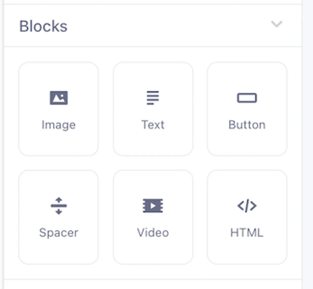
Доступні такі типи блоків:
- Зображення: завантажуйте зображення (PNG, JPG, GIF) і налаштовуйте їхній вигляд.
- Текст: додавайте й форматуйте текст для передавання вашого повідомлення.
- Кнопка: додавайте клікабельні кнопки з налаштовуваним текстом, посиланнями та стилями.
- Розділювач: вставляйте порожній простір, щоб налаштувати макет між іншими блоками.
- Відео: вбудовуйте відеовміст із таких платформ, як YouTube, Vimeo та інших.
- HTML: додавайте власний код HTML і CSS для розширеного налаштування вмісту електронного листа.
Кожен блок гнучкий і налаштовуваний, тому ви можете створити електронний лист, що відповідає стилю та вигляду вашого бренду.
Детальне пояснення блоків вмісту
Блок зображення
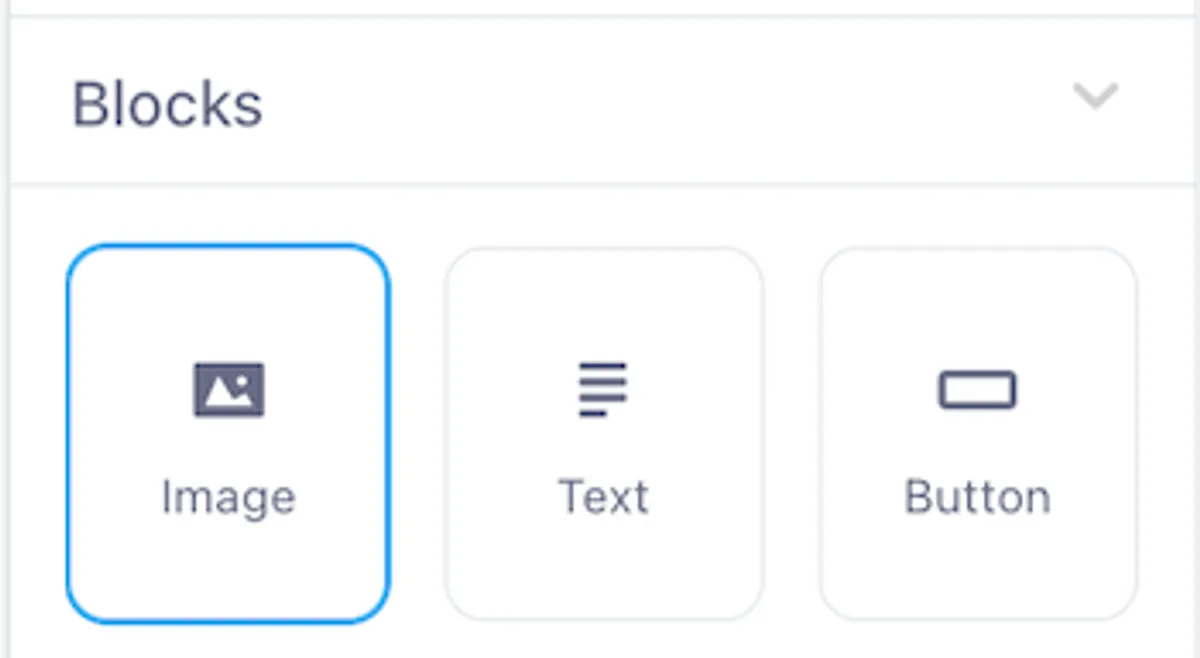
Блок зображення в редакторі електронних листів Stripo із функцією перетягування дає змогу додавати зображення до кампанії та налаштовувати їх.
Додавання блоку зображення
Додати блок зображення до електронного листа можна двома способами:
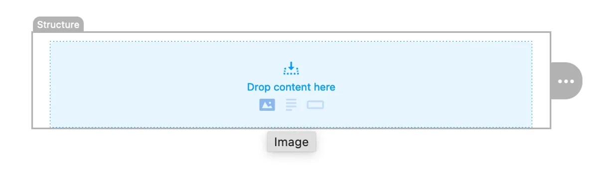
Варіант 1
Наведіть вказівник на область «Перетягніть сюди вміст» у структурі, а потім натисніть піктограму зображення. Вибрана структура одразу перетвориться на блок зображення.
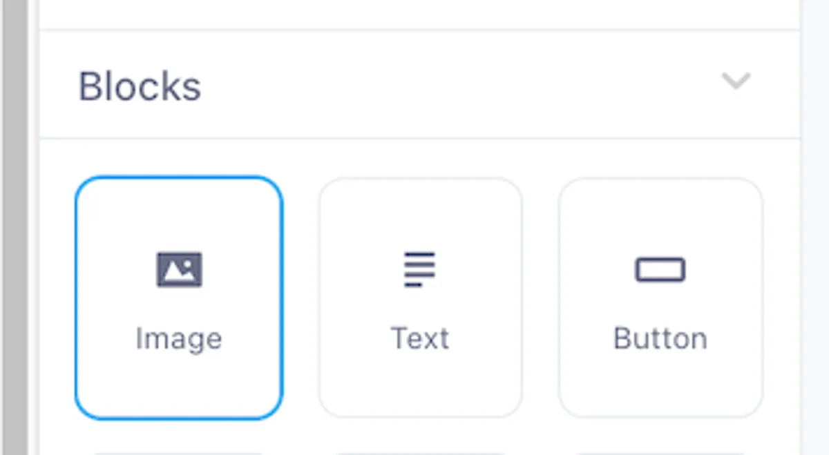
Варіант 2
Перейдіть до розділу Блоки на вкладці Вміст. Перетягніть блок зображення в потрібну структуру макета електронного листа. Цей спосіб дає більше контролю над точним розташуванням зображення.
Завантаження зображення
Після додавання блоку зображення завантажити зображення можна двома способами:
Перетягування
Ви можете безпосередньо перетягнути файл зображення (PNG, JPG, GIF) із комп’ютера в поле завантаження, яке з’явиться всередині блоку зображення.
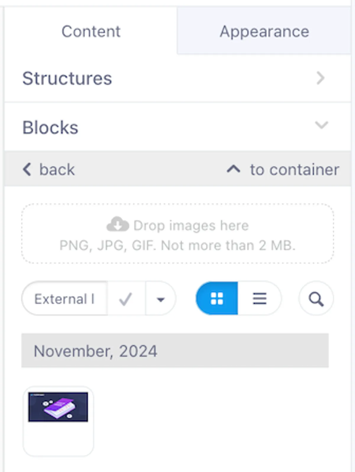
Завантаження з комп’ютера
Також можна натиснути піктограму хмари в блоці зображення, щоб відкрити файловий менеджер і вибрати зображення на комп’ютері (до 2 МБ). Після вибору зображення з’явиться і в блоці, і на вкладці вмісту праворуч.
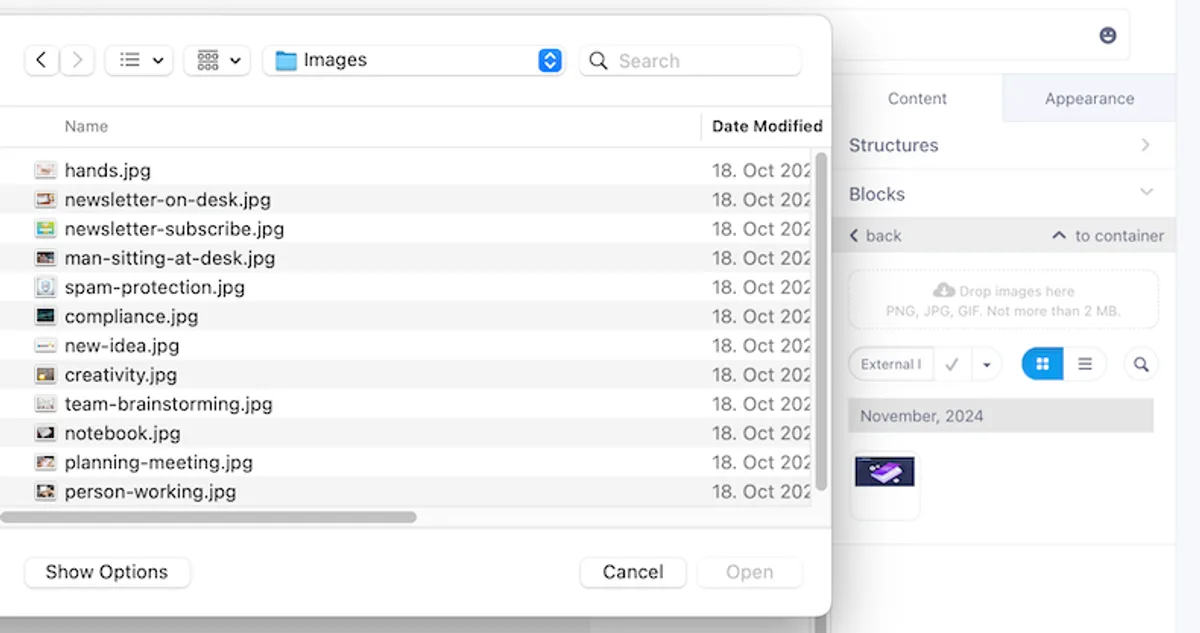
Заміна зображення
Щоб замінити зображення, скористайтеся параметром Змінити зображення на вкладці вмісту. Натисніть круглу піктограму Змінити зображення, щоб завантажити нове зображення або додати посилання на зображення із зовнішньої URL-адреси.
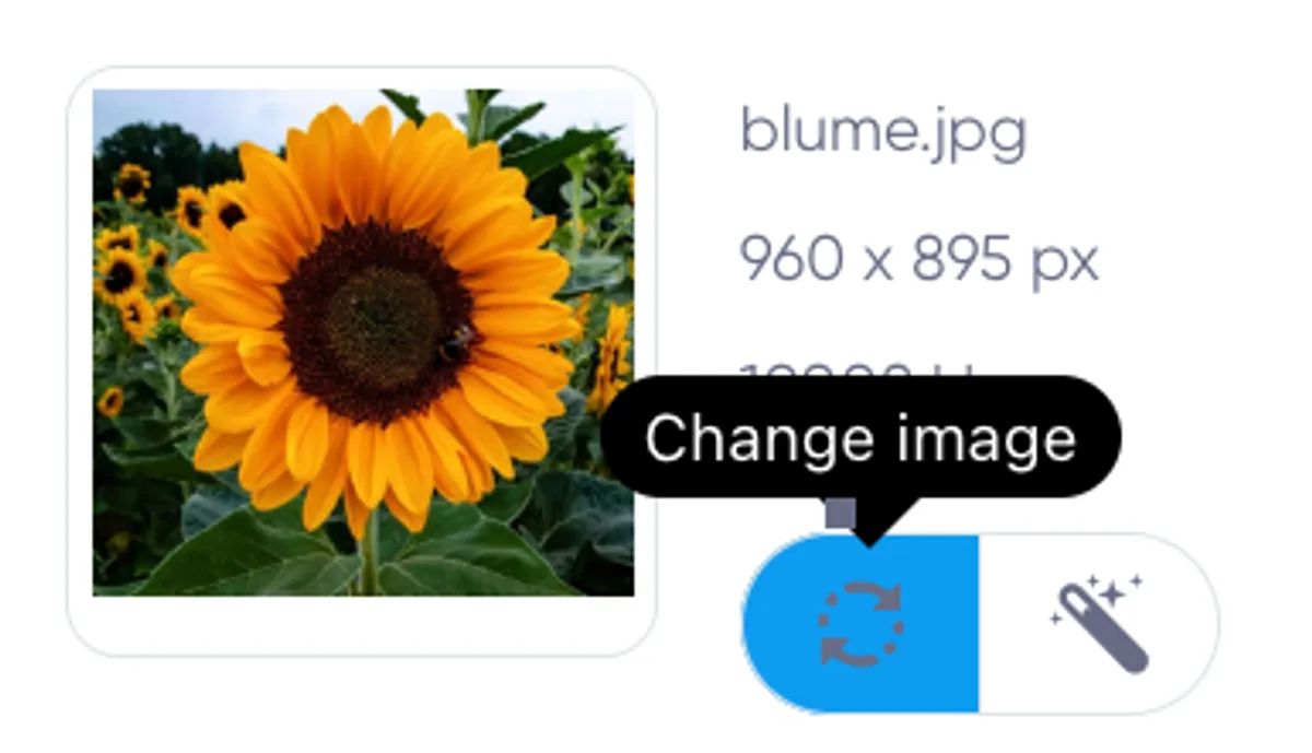
Редагування зображення
Після завантаження зображення ви можете відредагувати його безпосередньо на платформі. Вбудований редактор зображень Stripo дає змогу покращувати й налаштовувати зображення, не виходячи з редактора електронних листів.
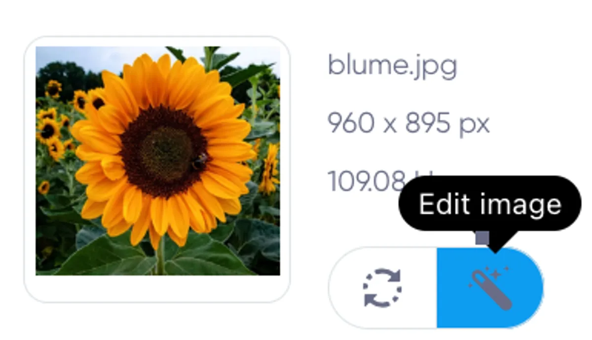
Відкриття редактора зображень
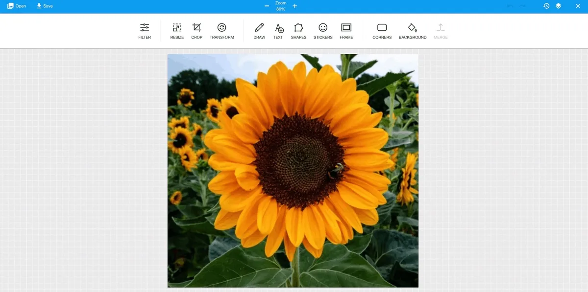
- Після завантаження зображення натисніть кнопку Редагувати зображення. Відкриється інтерфейс редактора зображень.
- Редактор пропонує широкий набір інструментів, розміщених у верхній панелі меню.
Доступні інструменти редагування зображень
-
Фільтри Застосовуйте різні фільтри одним натисканням, зокрема:
- Відтінки сірого
- Чорно-білий
- Різкість
- Інверсія
- Сепія
- Яскравість
- Колір
-
Змінити розмір Налаштовуйте розміри зображення. Ви можете:
- Задати певну ширину й висоту.
- Зберегти співвідношення сторін.
-
Обрізати Вибирайте частину зображення, яку потрібно залишити, і видаляйте небажані ділянки.
-
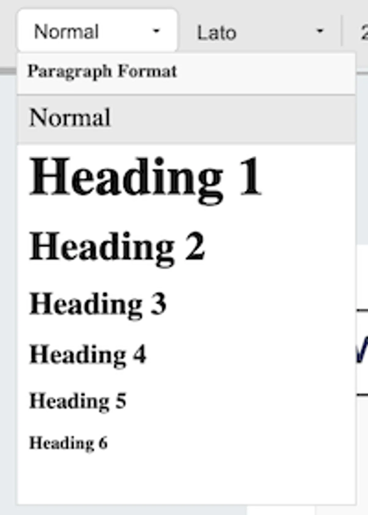
Трансформувати Поверта regular text, or various heading levels (Heading 1 to Heading 6) for creating a structured hierarchy in your email. This helps make the content more readable and organized.
2. Font Family
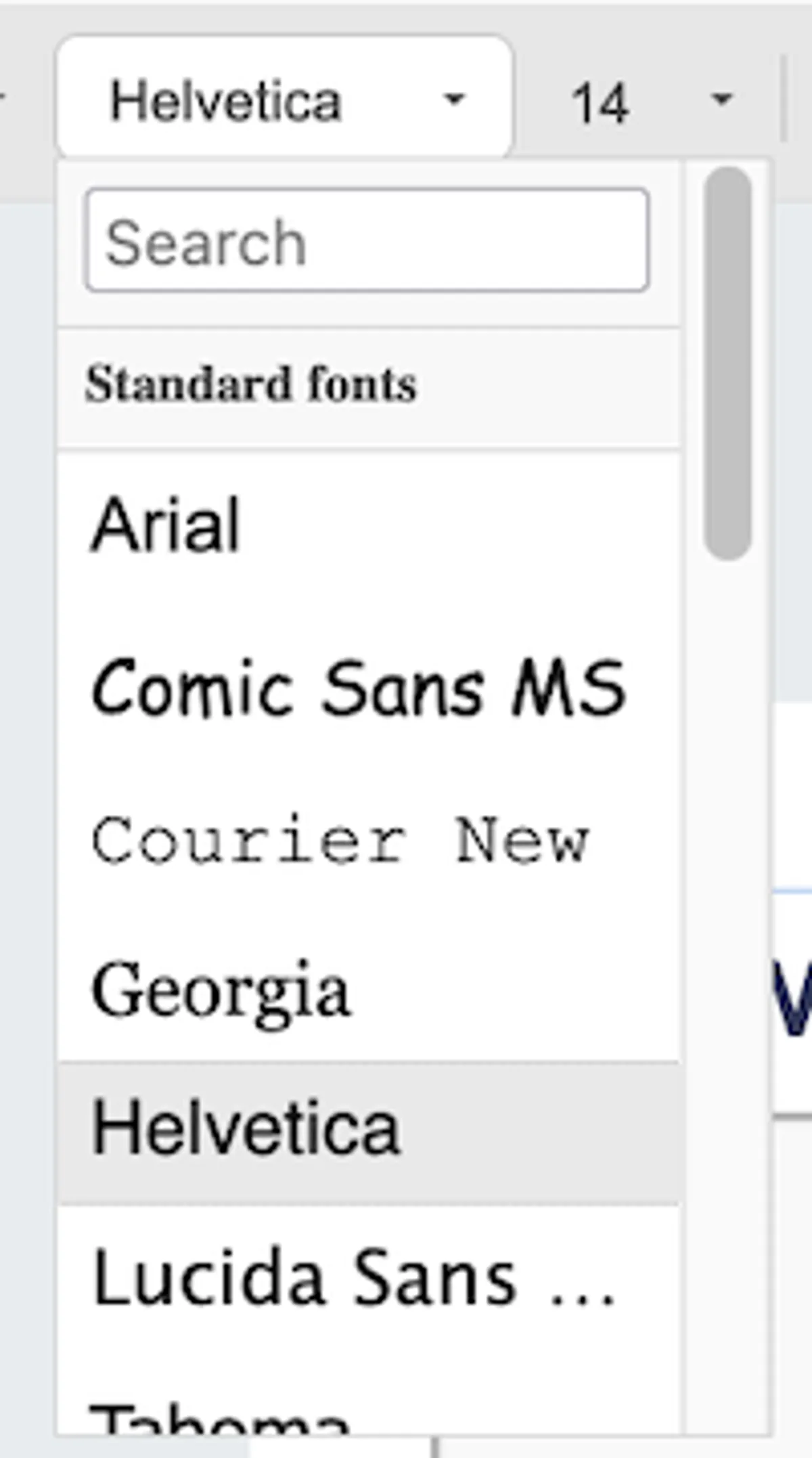
The default font is Arial, but you can choose from a variety of fonts, including common options like Georgia, Helvetica, and Courier New. There's also a search function to quickly find a specific font.
3. Font Size
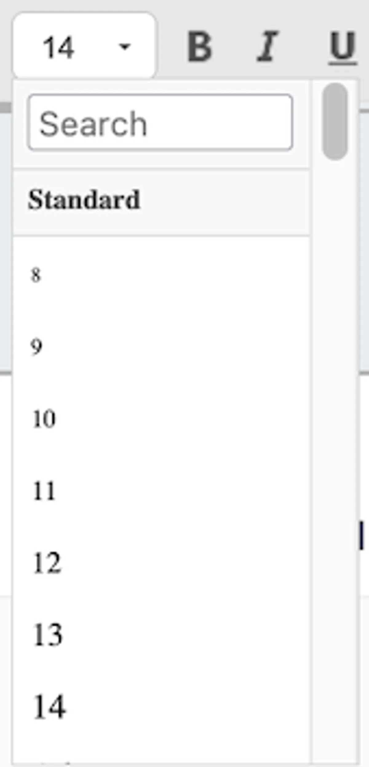
Adjust the font size from 8pt to 72pt. The default is 14pt, which works well for most email body text. Use the dropdown to quickly set the desired font size.
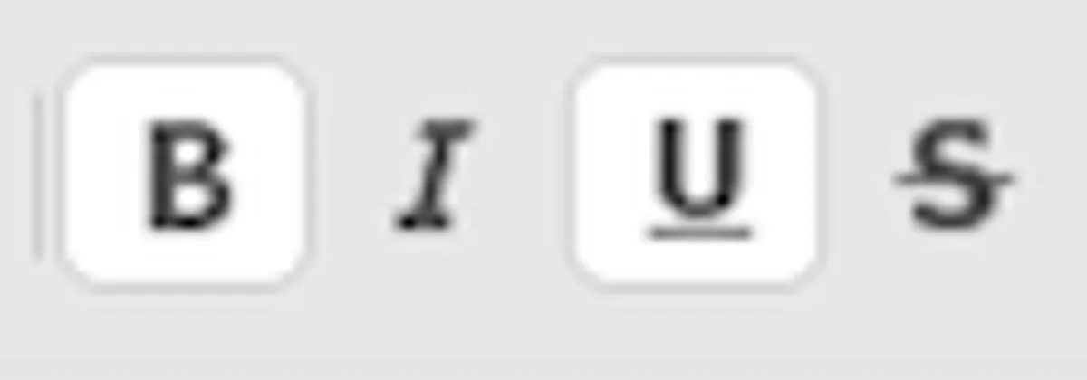
4. Text Styling
Style your text using the following options:
- Bold (B): Emphasizes text by making it bold.
- Italic (I): Italicizes the text for a more stylized appearance.
- Underline (U): Underlines text, commonly used for hyperlinks.
- Strikethrough (S): Draws a line through the text, useful for edits or removed content.
5. Advanced Text Styling (Three Dots Menu)
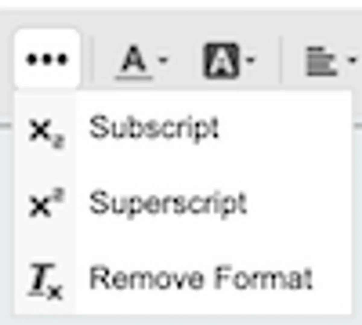
Clicking the three dots in the toolbar expands additional options:
- Subscript: Lowers text below the baseline (useful for footnotes or chemical formulas).
- Superscript: Raises text above the baseline (commonly used for exponents or ordinal numbers).
- Remove Formatting: Strips away any applied formatting, returning the text to its default style.
6. Text and Background Color
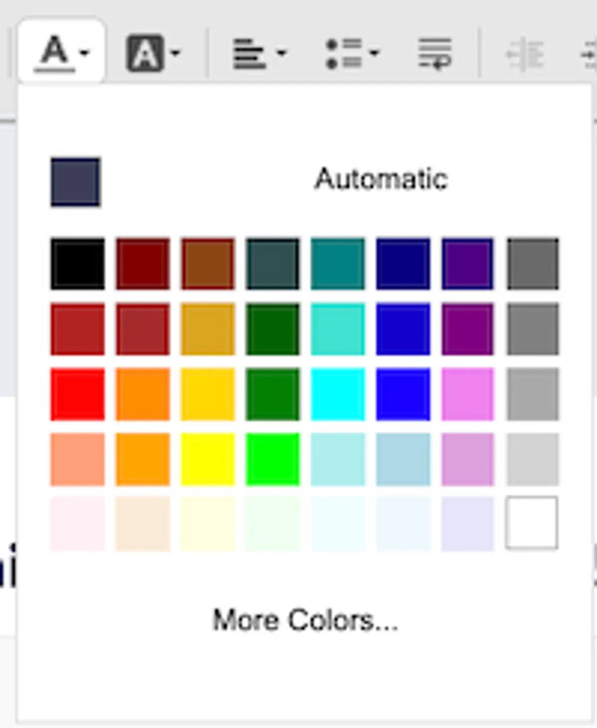
- Text Color: Click the Text Color button to choose from a palette or input a hex code for precise control over the text color.
- Background Color: Select a background (highlight) color for your text.
7. Text Alignment
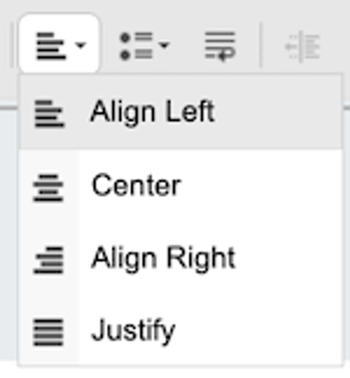
Align your text within the block:
- Align Left: Aligns text to the left.
- Center: Centers the text.
- Align Right: Aligns text to the right.
- Justify: Distributes text evenly across the width of the block.
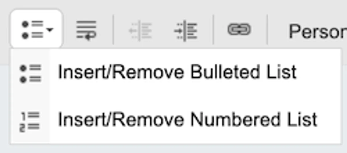
8. Lists
Create ordered (numbered) and unordered (bulleted) lists:
- Insert/Remove Bulleted List: Adds or removes bullet points.
- Insert/Remove Numbered List: Adds or removes a numbered list.
9. Line Wraps
Enable or disable line wrapping within the text block. When enabled, long lines of text automatically move to the next line.
10. Indentation
Adjust the indentation of your text:
- **Increase Indent**: Moves the text further from the margin, useful for sub-points or quotes.
- **Decrease Indent**: Reduces the indent, bringing the text closer to the left margin.

11. Insert Hyperlink
Learn how to add, edit, and manage hyperlinks in your email content.
Steps to Add or Edit a Link
a) Highlight the Text
Select the text you want to turn into a hyperlink.

b) Click the Link Icon
In the Text Toolbar, click the Link Icon.
c) Edit Link in the Settings Panel
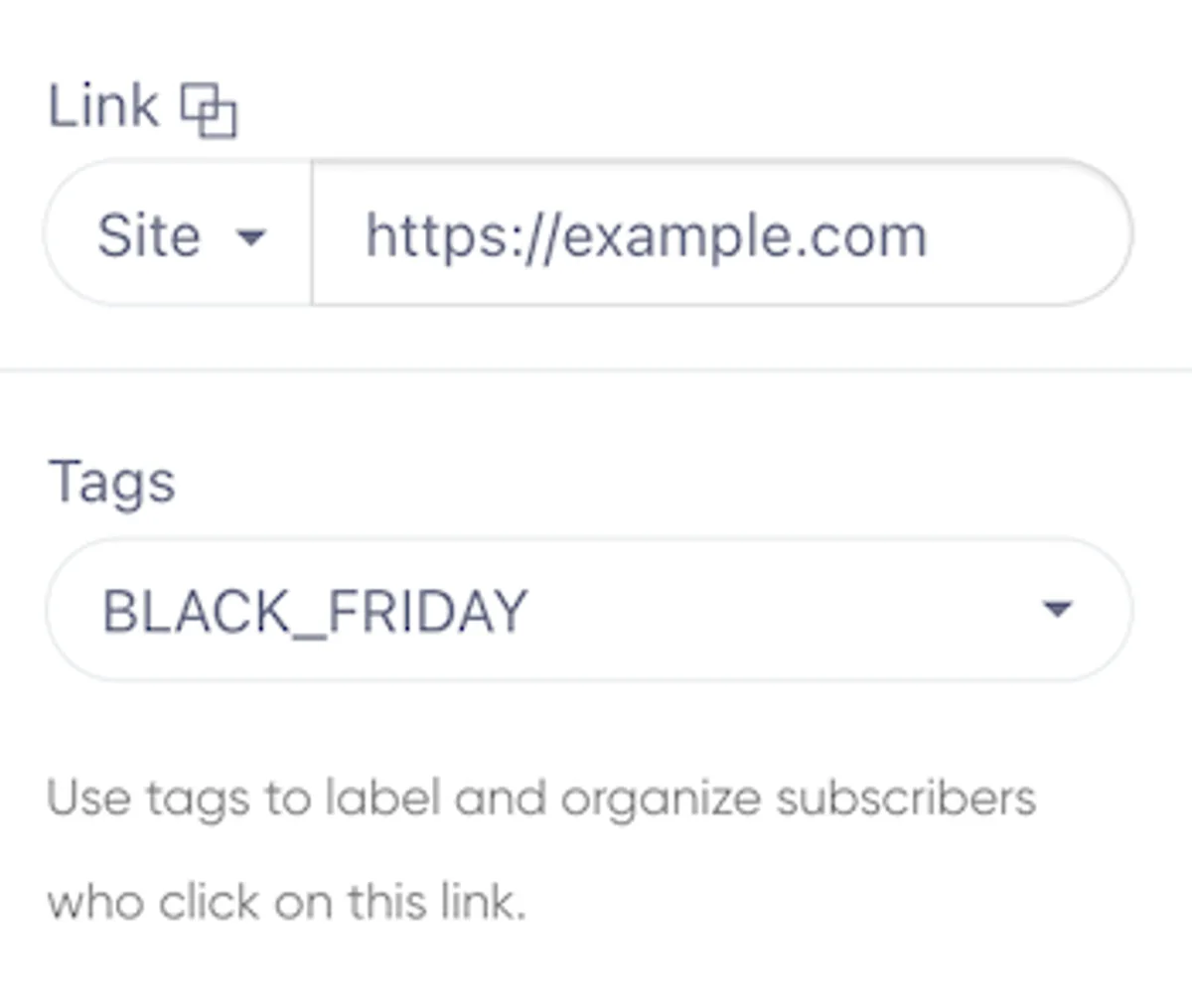
The Right-Hand Settings Panel will appear with link options:
- Link Field: Enter the URL or select from predefined options.
- Tag: Add tags to label subscribers or trigger automations.
Fixing Links After Sending
There's nothing worse than sending out a new campaign to your 2,365 subscribers, only to find that one of the links is broken due to a simple typo. Goodbye, Black Friday sales!
Fortunately, we’ve made it possible to fix broken links—even after the email has already been sent to your subscribers.
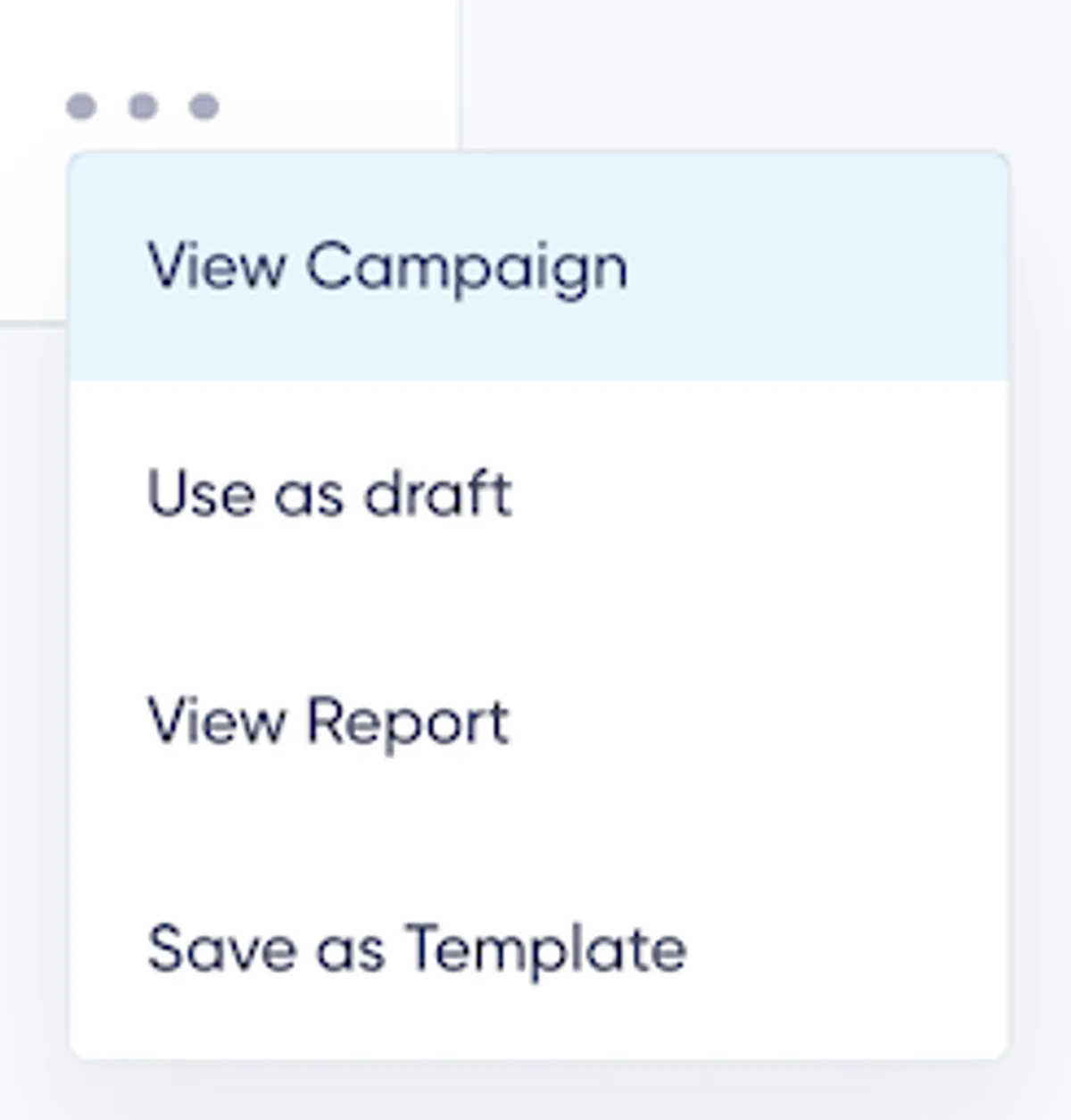
a) View Campaign
Locate the sent campaign in the overview, click the three dots, and choose View Campaign.
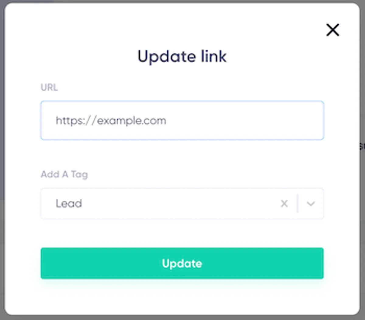
b) Modify Links or Tags
Scroll to the link list in campaign details to:
- Update Link Targets: Fix incorrect URLs.
- Manage Tags: Add or remove tags for automations.
Note: Ensure Click Tracking is enabled in campaign settings to use the link re-targeting feature.
Customizing Link Appearance
In the Right-Hand Settings Panel, you can adjust the link’s appearance:
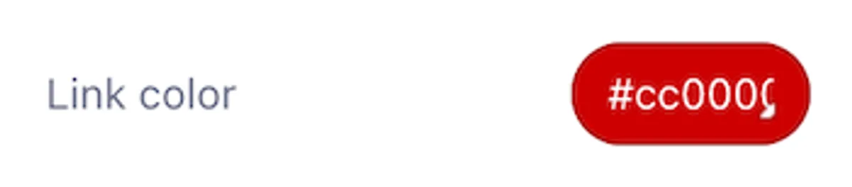
-
Link Color: Select a color or enter a hex code.
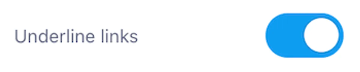
-
Underline Links: Enable or disable underlines for a cleaner look.
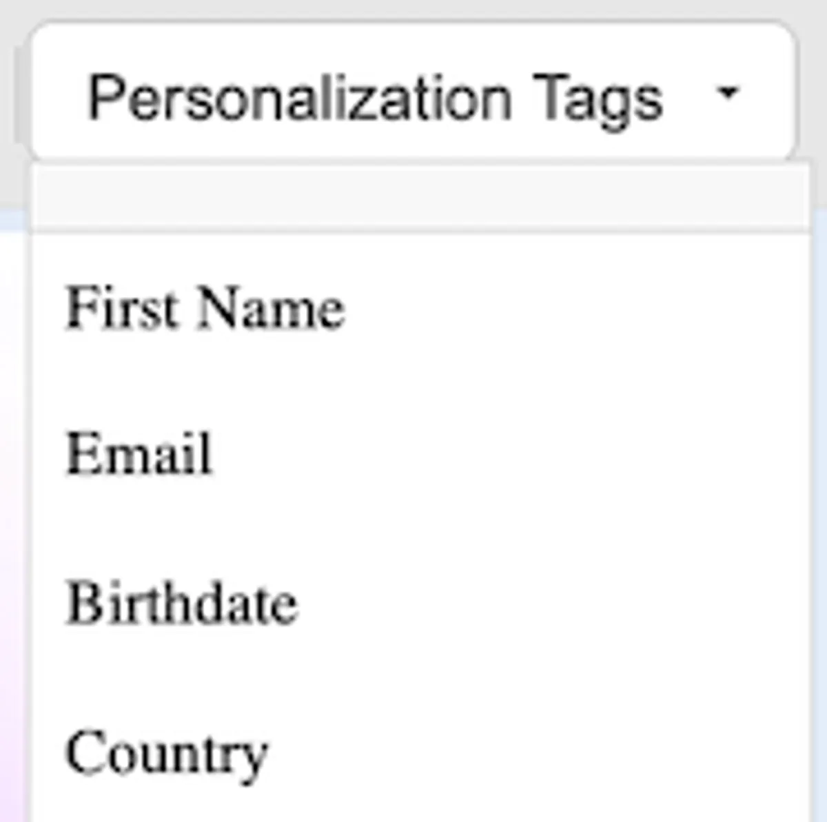
12. Personalization Tags
Use Personalization Tags to add dynamic content, such as the recipient's first name or other custom fields.
- Access the Personalization Tags dropdown in the toolbar to select common fields like First Name, Email, or Country, or define custom fields to tailor emails for each recipient.
13. Emojis
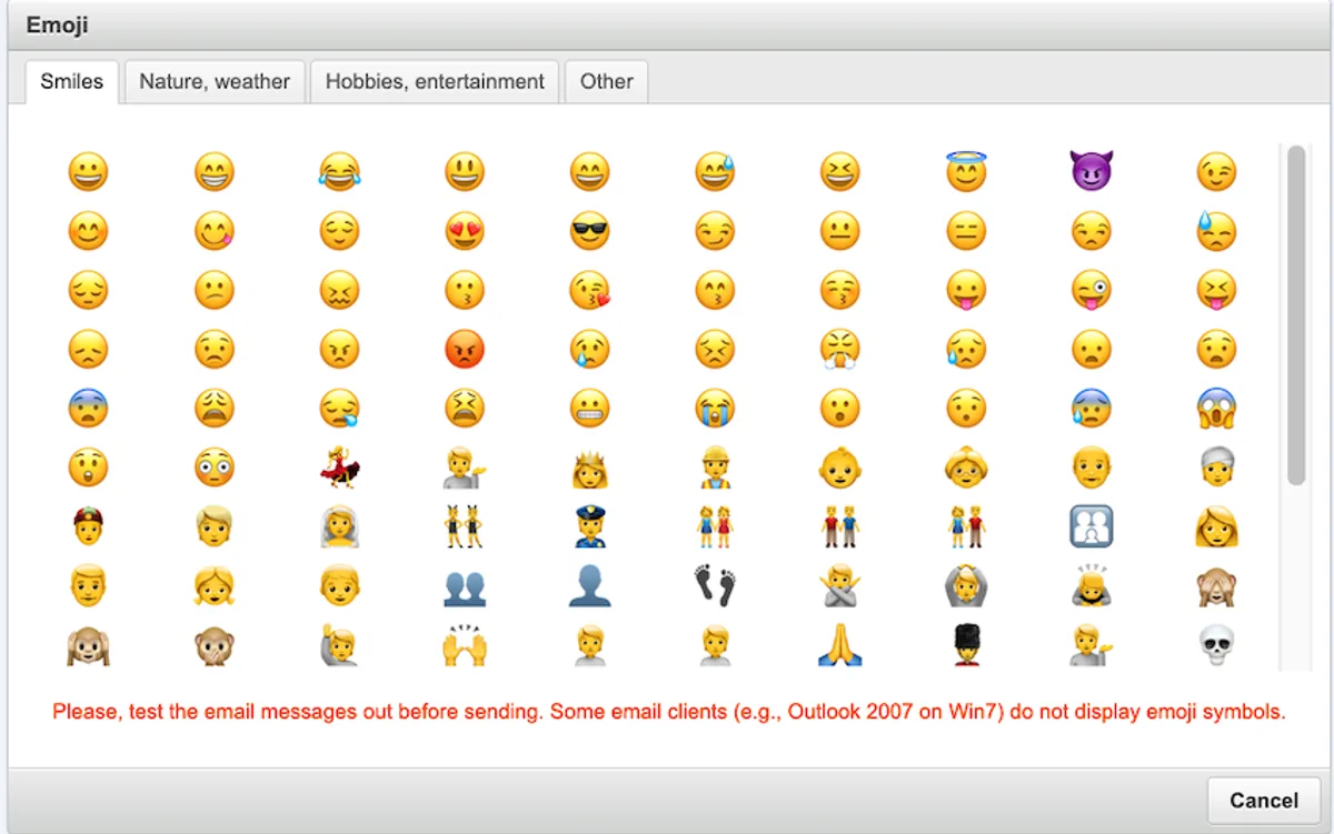
Add visual appeal to your text by including emojis.
- Click the Emoji Icon in the toolbar to open a categorized list of emojis for easy browsing.
- Compatibility Note: Test emails in certain clients like Outlook, as some may not display emojis correctly.
14. Table and Special Characters
At the end of the toolbar, click the three dots to reveal more advanced options.
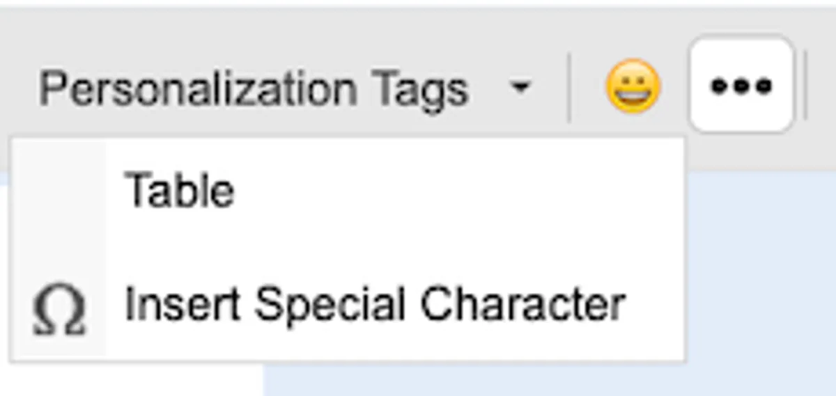
Table Insertion
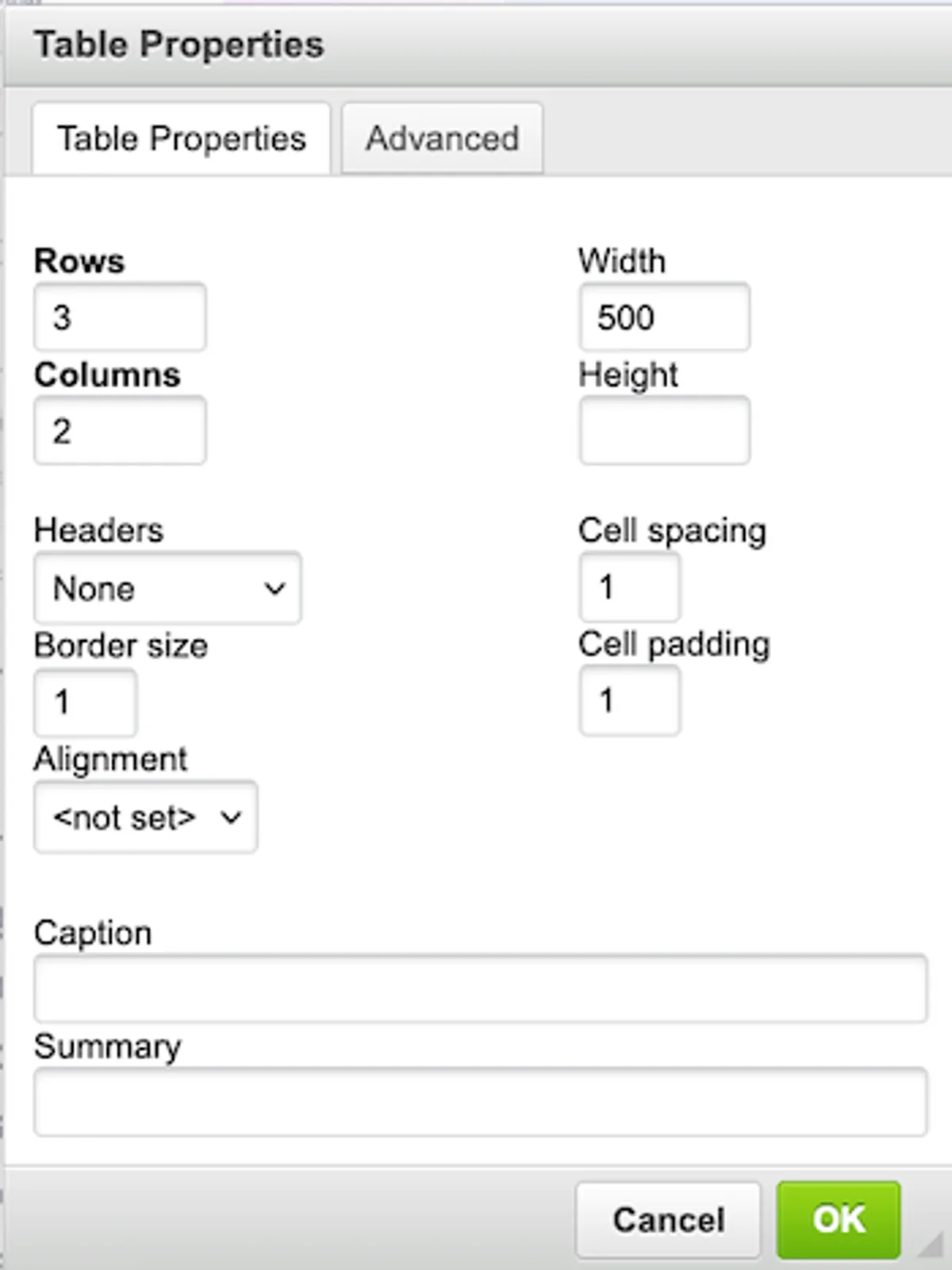
Create and customize tables to enhance your email layout.
- Define rows, columns, cell spacing, padding, and border size as needed.
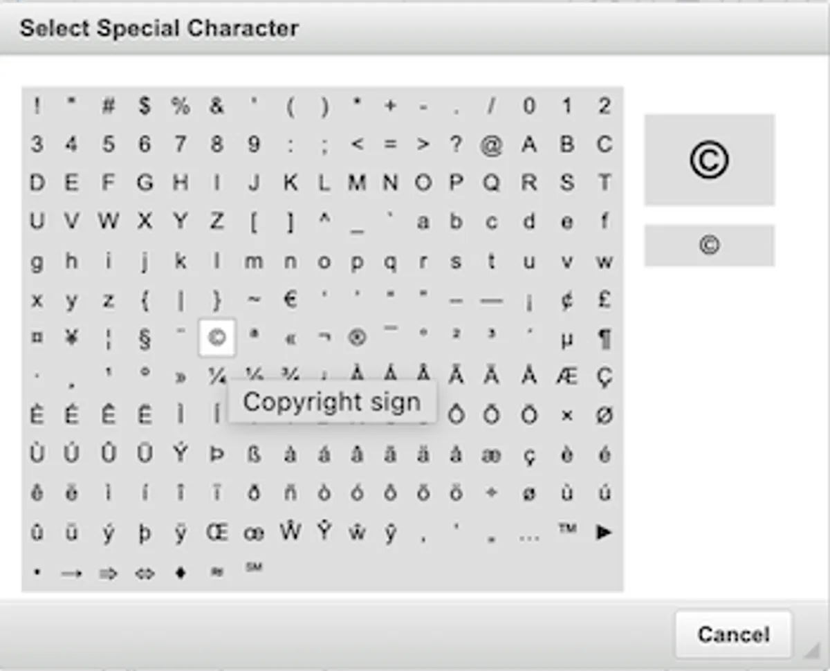
Insert Special Characters
Enhance your text with symbols, accented characters, and other non-standard characters.
- Access the Special Characters option to browse a wide variety of characters.
Additional Text Block Settings (Right Panel)
The right panel offers extensive control over the appearance and functionality of your text blocks. Below are the available settings:
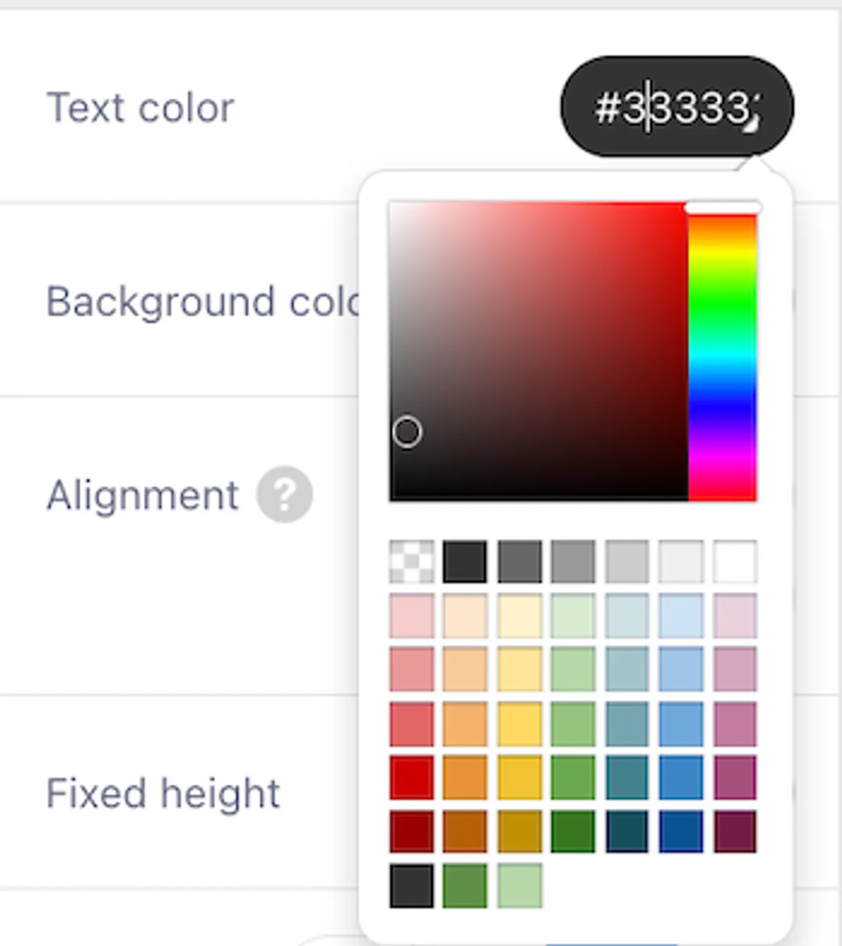
1. Text Color
Define the color of the text using the color picker or by entering a hex code.
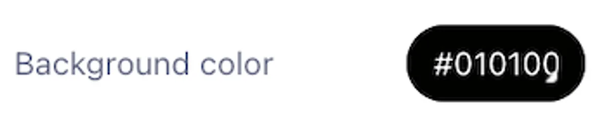
2. Background Color
Set a custom background color for the text block. By default, the background is transparent.
3. Link-Specific Settings
When the text block contains links, additional options appear in the settings:
-
Link Color: Adjust the color of links using the color picker or hex code.
-
Underline Links: Toggle the underline option on or off for links within the text block.
-
Link Editing: Select a link in the content area to edit its URL in the settings panel. You can also assign or update tags for the link using the dropdown menu labeled "Tags."
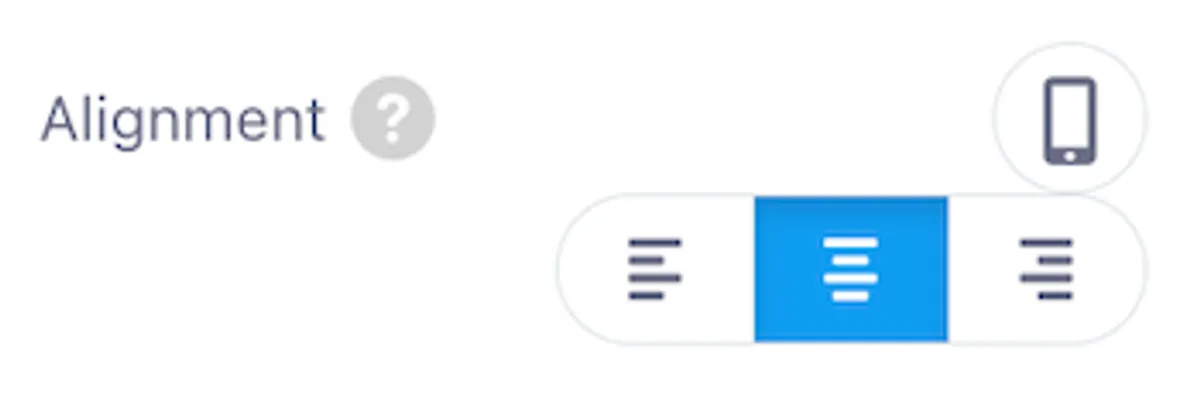
4. Alignment
Align the text block within its container: Left, Center, or Right.
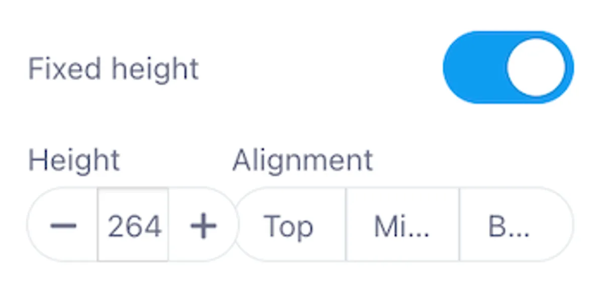
5. Fixed Height
Set a fixed height for the text block by enabling this option. You can also control vertical text alignment: Top, Middle, or Bottom.
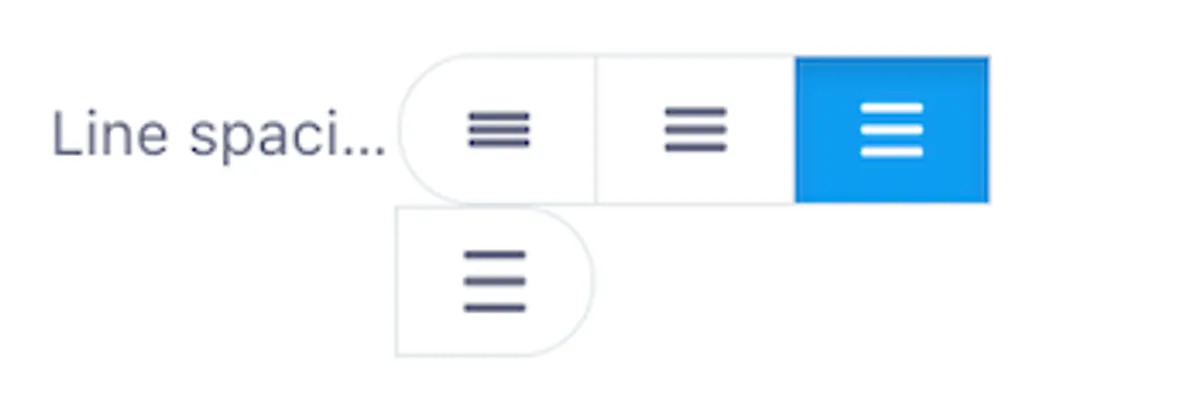
6. Line Spacing
Control the space between lines of text. Choose from Tight, Normal, or Wide.
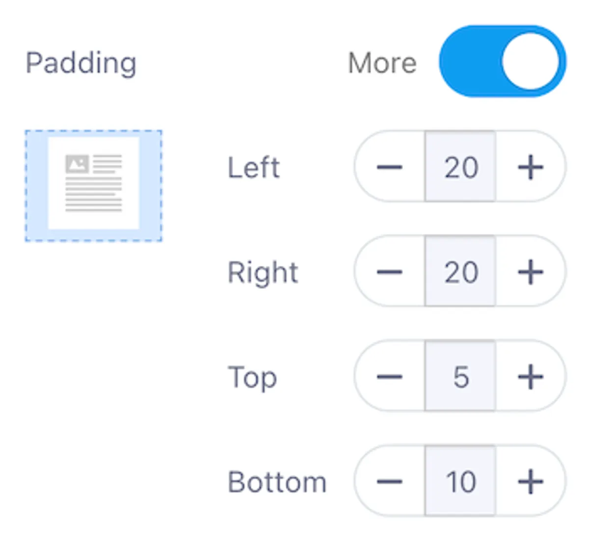
7. Padding
Adjust the space around the text block. Apply uniform padding or customize each side: Top, Bottom, Left, and Right.
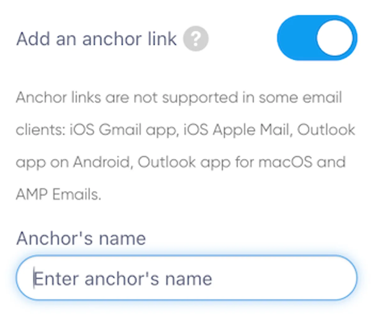
8. Anchor Links
Create anchor links to allow readers to jump to specific sections of your email. Note that some email clients do not support anchor links.
Button Block
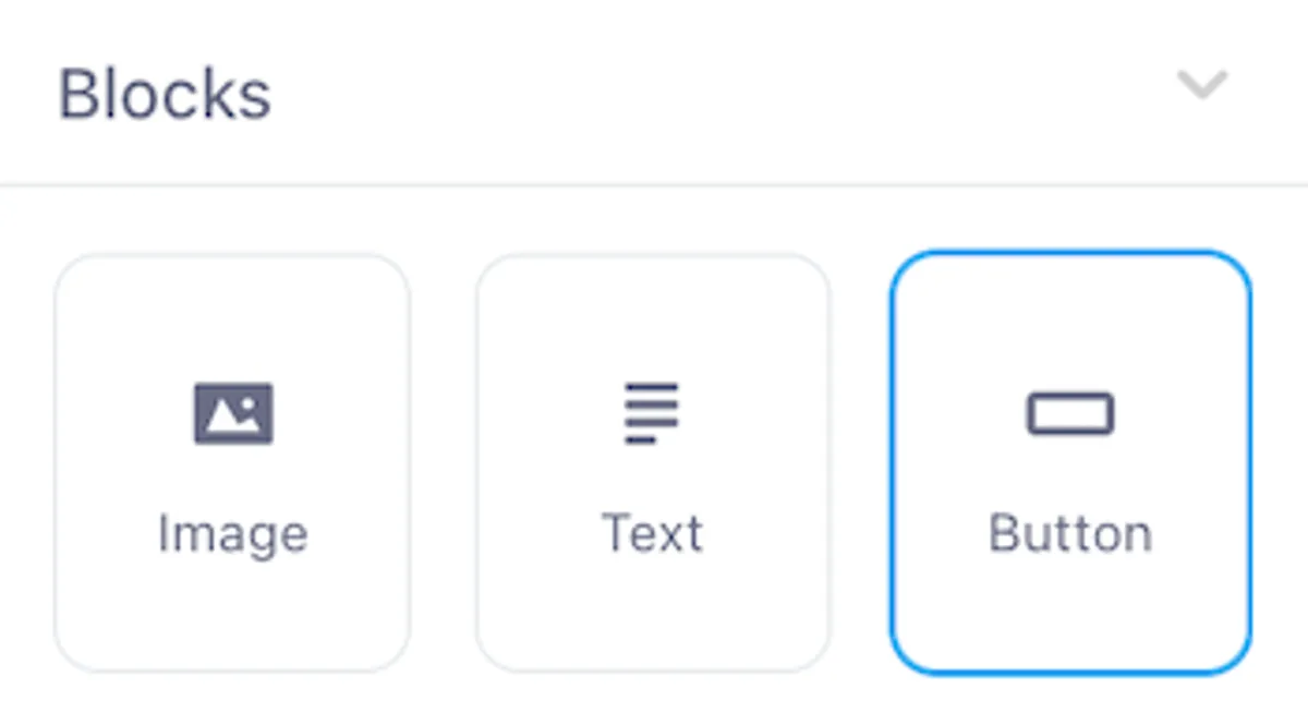
The Button Block allows you to add a clickable button to your email with customizable settings for functionality and style.
Link Settings
The Link option determines the action triggered when a recipient clicks the button.
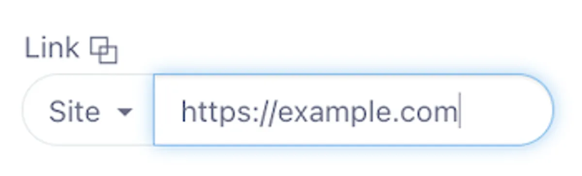
Available Link Types
- Normal Site Link (HTTP or HTTPS): Directs the user to a webpage.
- Mail Link: Opens the user's email client to compose a new email.
- File Link (FTP, FTPS): Links to a file on an FTP server.
- Skype: Initiates a Skype call or chat.
- Telephone (tel): Starts a phone call on compatible devices.
- SMS: Opens the messaging app with a pre-filled recipient number.
- Viber: Opens the Viber app for messaging or calls.
- Another Protocol Type: Specify a custom protocol not listed above.
Social Sharing Options
You can also set the button for social or email sharing:
- X (formerly Twitter)
- Email Sharing
URL Field
Next to the link type, the URL Field (typically starting with https://) allows you to enter the specific address corresponding to the link type.
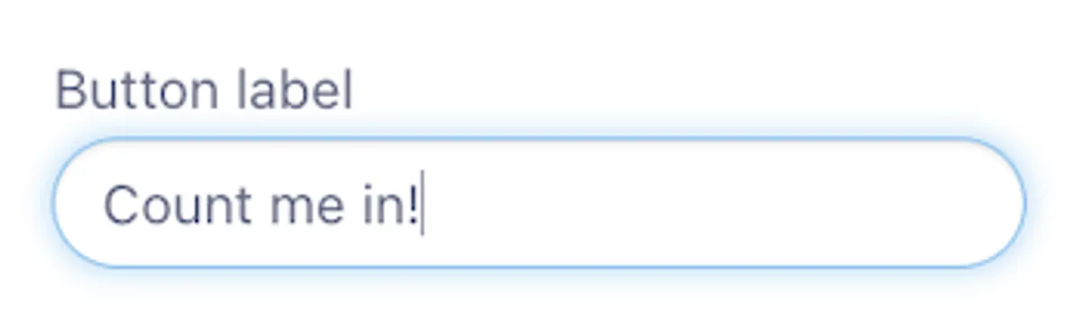
Button Label
Customize the button's label to reflect your call to action. The default label is "Button," but you can change it to options like "Learn More", "Subscribe Now", or "Shop Now".
Text Style
The Text Style settings allow you to adjust the appearance of the button's text.
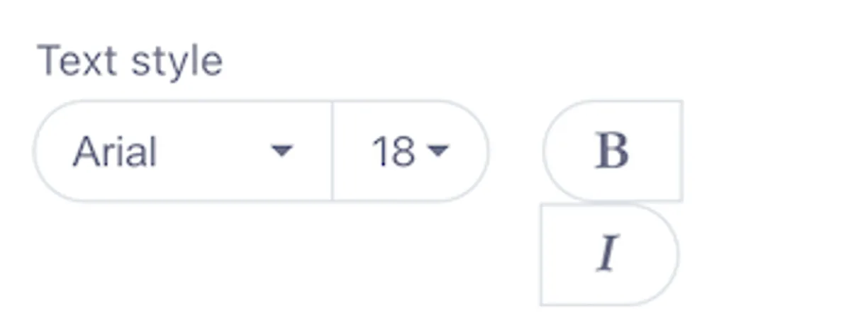
Font Selection
Choose from a variety of standard fonts, including:
- Arial
- Comic Sans MS
- Courier New
- Georgia
- Helvetica
- Lucida Sans Unicode
- Tahoma
- Times New Roman
- Trebuchet MS
- Verdana
For non-standard fonts, additional options include:
- Arvo
- Lato
- Lora
- Merriweather
- Merriweather Sans
- Noticia Text
- Open Sans
- Playfair Display
- Roboto
- Source Sans Pro
At the top of the font list, a search box helps you quickly locate a specific font.
Font Size and Formatting
- Font Size: Choose from 8 to 72, depending on how prominent you want the button text to appear.
- Text Formatting: Apply Bold or Italic styling using the "B" or "I" icons to emphasize the button text.
Color Settings
Customize the button's appearance by adjusting its color settings.
-
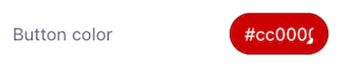
Button Color: Change the button's background color. The default is green (
#31cb4b). Use the hex code field or color picker to select a new color. -
Text Color: Define the button's text color. The default is white (
#ffffff). Choose a color that contrasts well with the button background for readability. -
Background Color: Adjust the background of the button's container. By default, this is transparent, but you can change it to make the button stand out against the email background.


Border Radius
Control the roundness of the button's corners using the Border Radius setting.
- Default Value: 30 (moderately rounded corners).
- Range: 0 (square corners) to 100 (pill-shaped button).
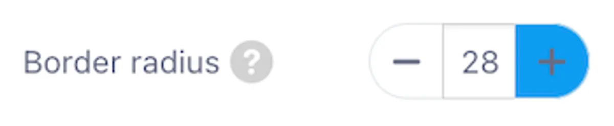
Note: To ensure rounded corners display correctly in Microsoft Outlook, activate the "Support of Outlook" option in the Appearance tab.
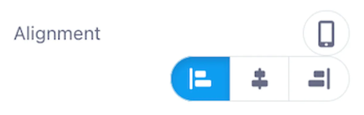
Alignment
Position the button within its content area using the Alignment setting.
- Options: Left, Center, Right.
- Common Usage: Center alignment for emphasis, left or right alignment for design consistency.
Fixed Height
Enable the Fixed Height option to maintain consistent button dimensions.
- Default: Deactivated.
- Minimum Height: 44 pixels.
- Content Vertical Alignment: When fixed height is enabled, align the button's content to the Top, Middle, or Bottom for precise positioning.

Button with Icon
The Button with Icon option allows you to include an icon alongside the button text, enhancing visual appeal and reinforcing the call to action. This feature is deactivated by default.
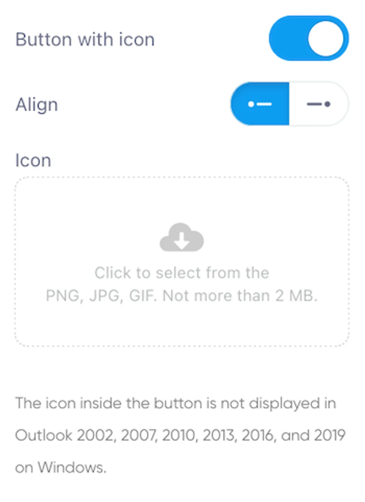
- Supported Formats: Upload icons in PNG, JPG, or GIF format, with a maximum file size of 2 MB.
- Icon Positioning: Choose to display the icon on the Left or Right side of the button text.
Note: Icons are not displayed in certain versions of Microsoft Outlook on Windows, including:
- Outlook 2002, 2007, 2010, 2013, 2016, and 2019. This limitation is due to how these email clients render HTML emails. Consider this if a large portion of your audience uses these clients.
Border Settings
Customize the button's borders for added style and emphasis.
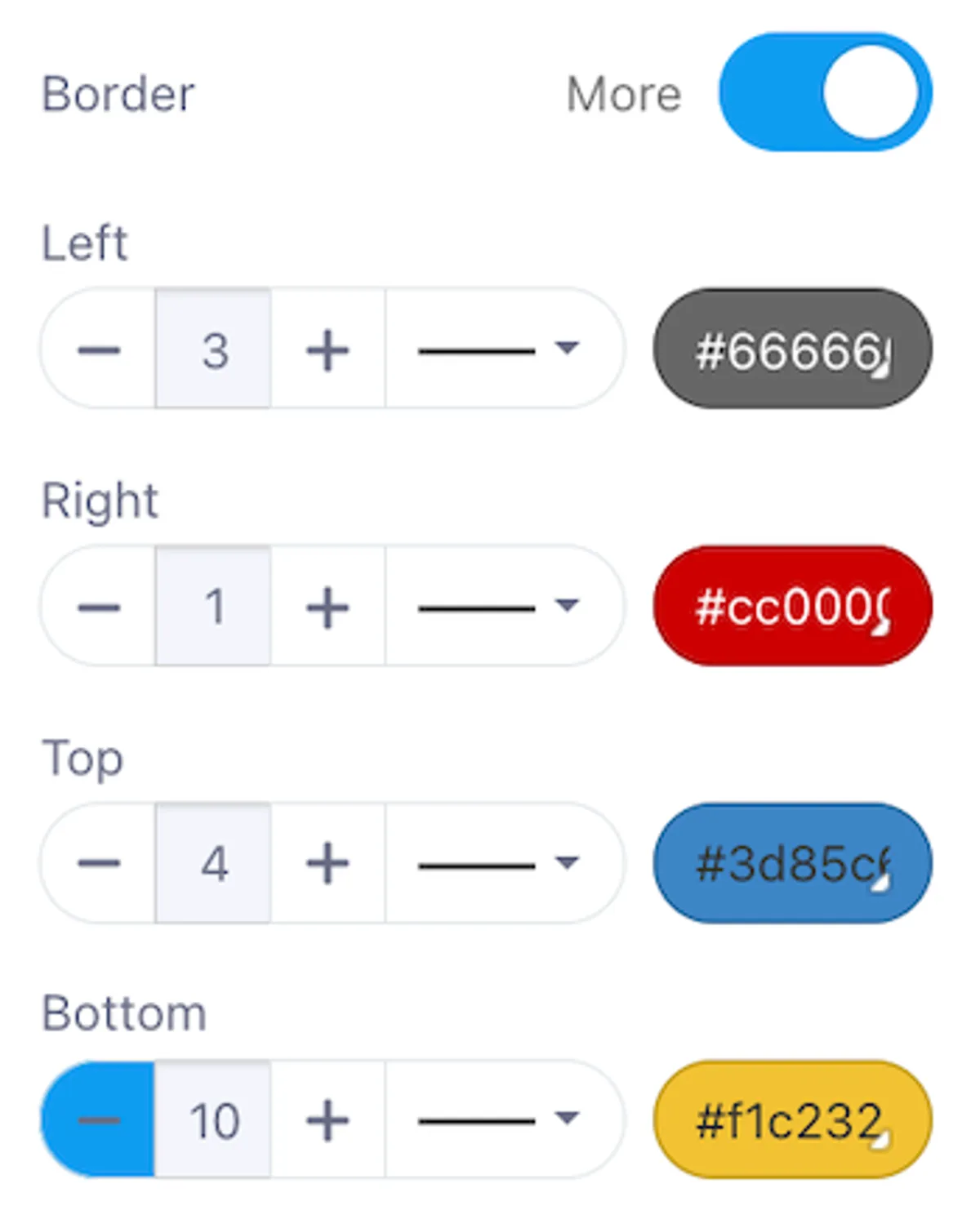
- Border Width: Set the width for each side (left, right, top, and bottom) individually, up to 40 pixels.
- Border Style: Choose from Solid, Dashed, or Dotted styles.
- Border Color: Use the color picker or enter a hex code to match the border color with your brand or design scheme.
Internal Padding
Adjust the space inside the button, between the content (text and icon) and the button's border.
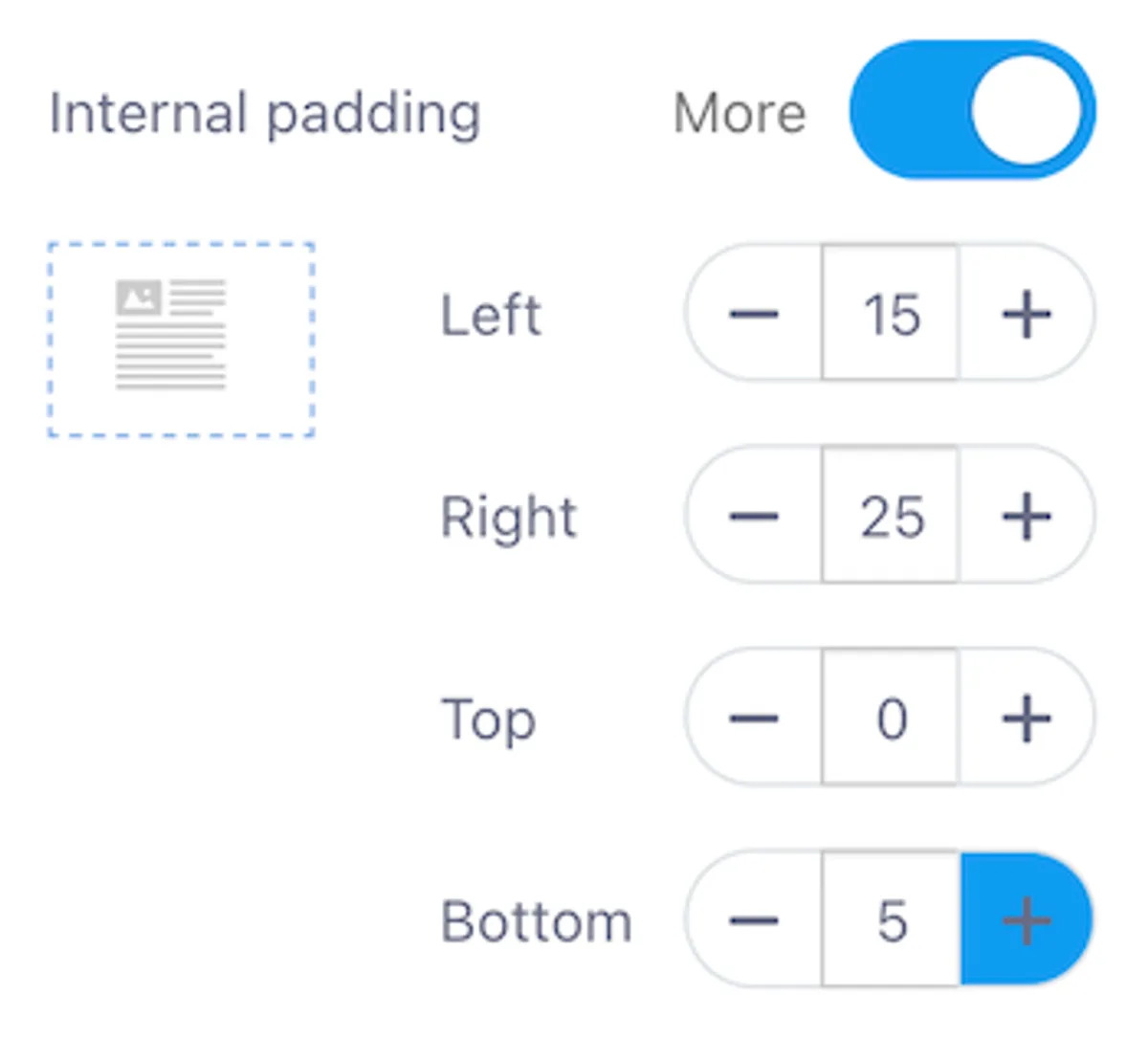
- Customization Options: Define padding values for the Left, Right, Top, and Bottom sides, up to a maximum of 99 pixels.
- Impact: Internal padding affects the button's overall size and the position of the content within the button.
External Padding
Control the space outside the button to adjust its position relative to other elements in the email layout.
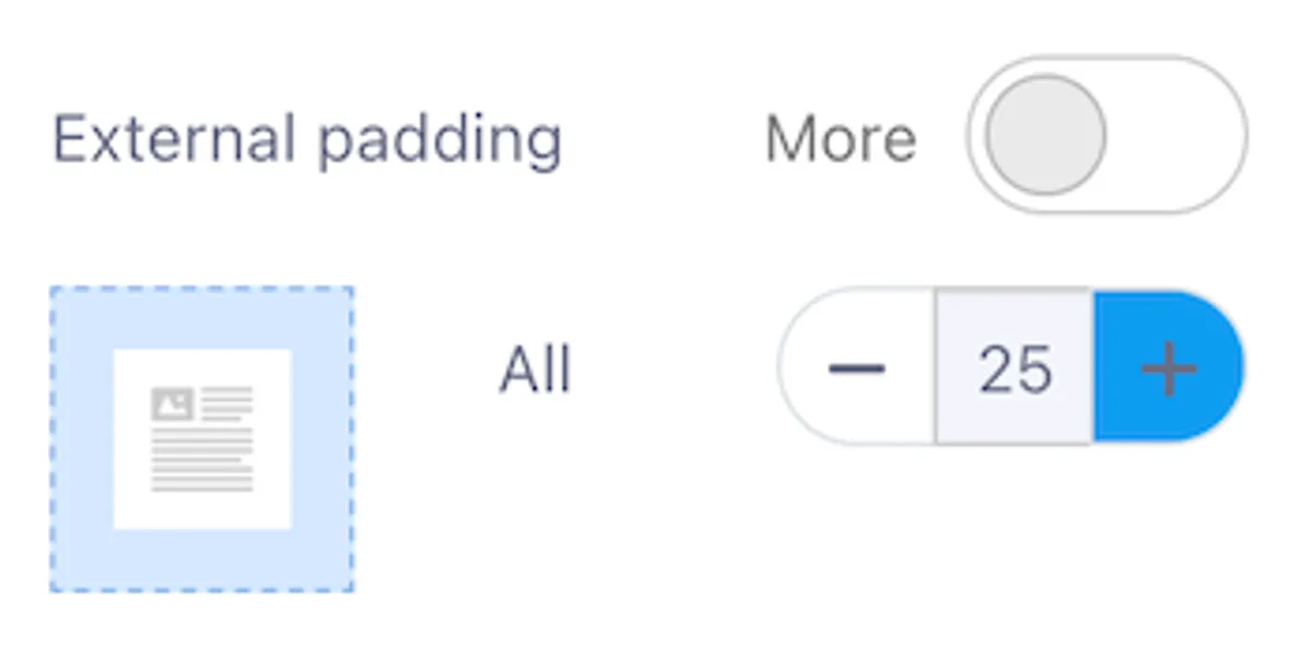
- Customization Options: Set external padding values for the Left, Right, Top, and Bottom sides, up to a maximum of 40 pixels.
- Use Case: Ensures the button doesn’t appear too close to other content or the edges of the email.
Add Anchor Link
Use anchor links to direct readers to specific sections within the same email, providing quick navigation in longer newsletters.
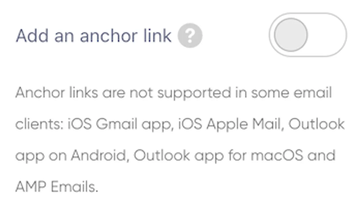
- Anchor Name: Define a target within the email and link the button to this anchor. When clicked, the email scrolls to the specified section, improving user navigation.
Important: Anchor links are not supported in certain email clients, including:
- iOS Gmail App
- iOS Apple Mail
- Outlook App for Android
- Outlook App for macOS
- AMP Emails
Test your email thoroughly to ensure functionality across different email clients and determine if this feature suits your audience.
Spacer Block
The Spacer Block lets you add adjustable space within your email content, providing control over its size, alignment, appearance, and internal spacing. Below, you'll find details about the two types of spacers: Normal Spacer and Dynamic Spacer.
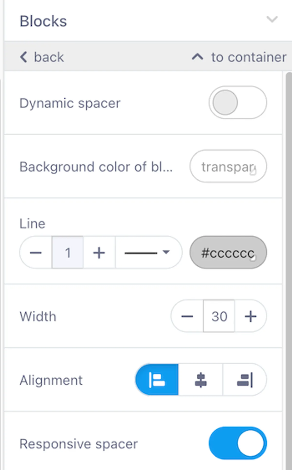
1. Normal Spacer
The Normal Spacer is a line element that visually separates sections in your email.

Key Settings
-
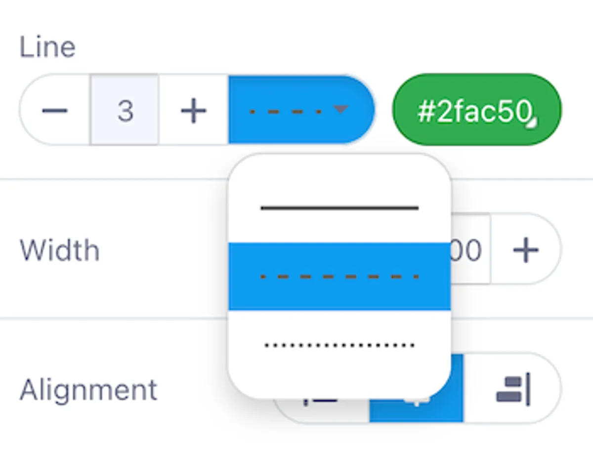
Line Thickness and Style Customize the thickness, style, and color of the line:
- Thickness: Adjust using the + and - buttons (starting from 1).
- Style: Choose between solid, dashed, or dotted.
- Color: Set a custom color using a hex code or color picker (default:
#cccccc).
-
Width Define how far the spacer line spans across your content. Adjust the width in pixels using the + and - buttons.
-
Alignment Align the line to the left, center, or right to match your layout.
-
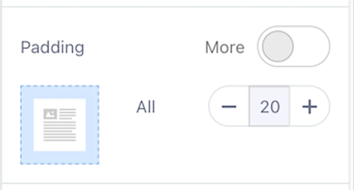
Padding Control the internal spacing around the spacer:
- Default: Padding is set to 20 on all sides.
- Use the More toggle to specify padding for individual sides:
- Top
- Right
- Bottom
- Left
Use Case
The Normal Spacer is ideal for creating clean, visual separations between sections in your email, ensuring a well-organized and professional layout.
2. Dynamic Spacer
The Dynamic Spacer is an invisible block of empty space designed to create breathing room within your email layout.

Key Features
-
Height Adjustment Adjust the height directly within the content area or via the control panel using the + and - buttons. The height determines how much vertical space is added between sections.
-
Background Color By default, the spacer has a transparent background, but you can apply a custom background color using a hex code or the color picker. This allows the spacer to function as a visible block if needed.
-
Responsive Behavior The Responsive Spacer option ensures that the spacer adapts dynamically to different screen sizes for an optimal layout across devices. This feature is enabled by default.
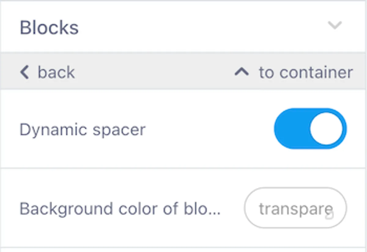
Key Differences Between Normal and Dynamic Spacers
- Dynamic Spacer: Adds empty space without a visible line.
- Normal Spacer: Includes line-specific settings such as:
- Line width
- Alignment
- Line styles
- Padding
The Dynamic Spacer does not support these features and is purely designed for separation without visual elements.
3. Add Anchor Link
Anchor links can be applied to both spacer types, allowing users to navigate directly to the spacer's location from another part of the email. This is especially useful for creating in-email navigation in longer newsletters.
Note: Anchor links are not supported by certain email clients, including:
- Microsoft Outlook
- Gmail (on mobile)
Video Block
The Video Block enables you to embed videos into your email and customize their appearance and behavior. It supports video links from platforms like YouTube and Vimeo, providing flexibility and control over how the video is presented.
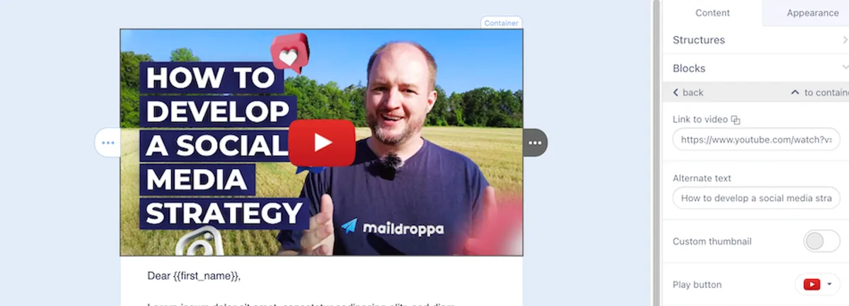
1. Link to Video
Add the video URL in the Link to Video field. Supported platforms include YouTube, Vimeo, and other embeddable services.
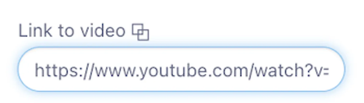
-
Automatic Behavior: When a valid URL is added:
- A preview image is automatically generated using the video thumbnail from the platform.
- The Alternate Text field is auto-filled with the video title or description (if available).
-
Editable Fields: You can manually edit or replace the generated preview image and text if needed.
2. Alternate Text
The Alternate Text field ensures accessibility by displaying a description of the video if it fails to load.
- Auto-filled when a supported video URL is added.
- Customizable to fit your content needs.
3. Custom Thumbnail
Upload a custom image to replace the default video preview.
- How to Enable: Toggle the Custom Thumbnail option.
- Supported Formats: PNG, JPG, or GIF.
- When to Use: Replace the generated thumbnail when it doesn’t align with your email's design.
4. Play Button
Customize the overlay Play Button for the video thumbnail.
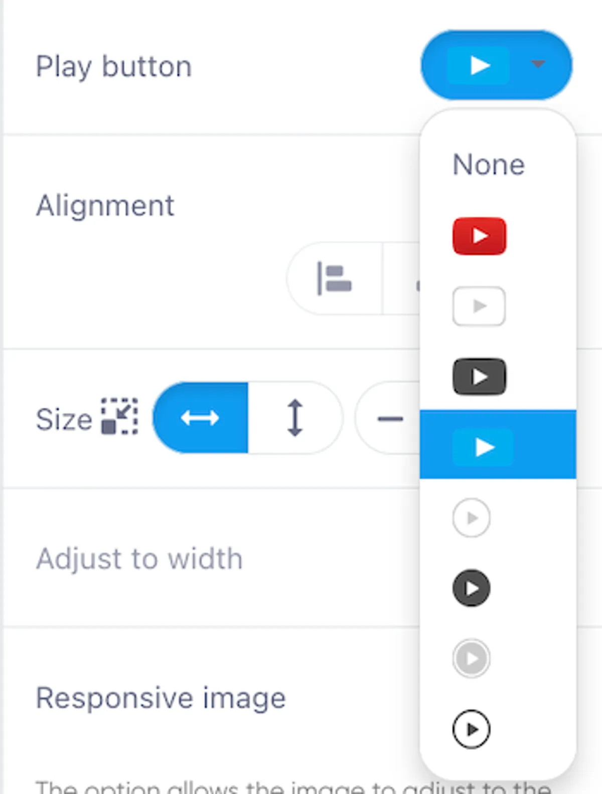
- Available Options:
- Choose from YouTube, Vimeo, or other play button styles.
- Select “None” to hide the play button entirely.
5. Size
Adjust the dimensions of the video to fit your email design.

- Width and Height: Use the + and - buttons or manually enter values to control size.
- Responsive Design: Ensure your video fits seamlessly across various devices.
6. Adjust to Width
Enable the Adjust to Width toggle to make the video automatically fit the width of its container. This ensures the video maintains a responsive design across various devices.
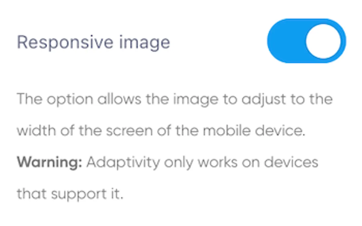
7. Responsive Image
The Responsive Image toggle ensures the video thumbnail adjusts to fit the width of the screen on mobile devices.
- Note: Responsiveness depends on support from the device and email client.
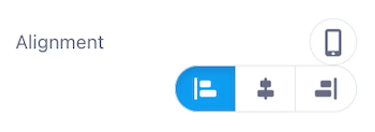
8. Alignment
Use the Alignment setting to control the horizontal positioning of the video in the block:
- Left: Aligns the video to the left.
- Center: Centers the video.
- Right: Aligns the video to the right.
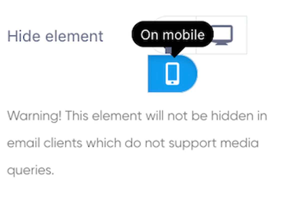
9. Mobile-Specific Options
Customize the video’s behavior and appearance on mobile devices:
-
Hide Element on Mobile Hide the video block on mobile devices if needed.
- Note: This feature relies on media query support and may not work in all email clients.
-
Mobile Padding Adjust the padding around the video for mobile displays.
- Use the More toggle to set individual padding values for:
- Top
- Right
- Bottom
- Left
- Use the More toggle to set individual padding values for:
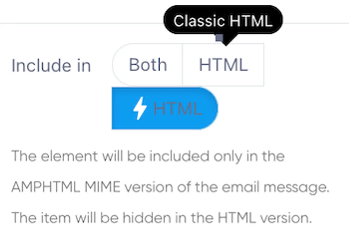
10. Include in AMPHTML or HTML
Choose whether the video block appears in specific email versions:
- Both AMPHTML and HTML
- AMPHTML-only
- HTML-only
This option ensures the video is appropriately included based on the email version being delivered.
HTML Block
The HTML Block lets you insert custom HTML and CSS code into your email, offering flexibility for advanced customizations while adhering to email client compatibility. Whether you're adding a single HTML element or designing an entire email, this block is your tool for tailored designs.
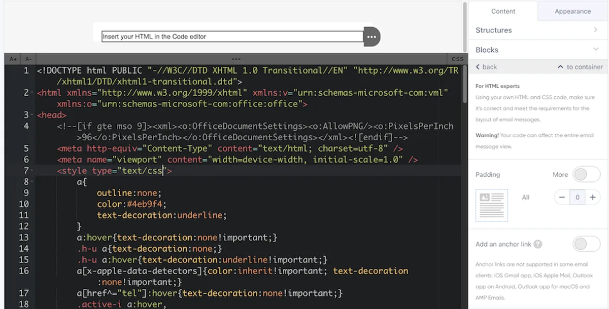
1. Code Editor Interface
When you select the HTML Block, a black code editor window appears in the content pane. This editor allows you to write, paste, or modify custom code. The editor includes two sections:
- HTML Section: Add or edit the HTML structure for your email.
- CSS Section: Open a separate CSS editor to style your content.
2. Font Size Adjustment
Adjust the font size of the code in the editor for better readability:
- Use the A+ button to increase the font size.
- Use the A- button to decrease the font size.
3. Editor Window Size Adjustment
Resize the code editor window to fit your working preferences:
- How to Adjust:
- Hover over the three dots at the top-center of the editor window.
- Drag the slider control up or down to increase or decrease the editor size.
This feature is particularly useful for managing larger or more detailed blocks of code.
4. CSS Editor
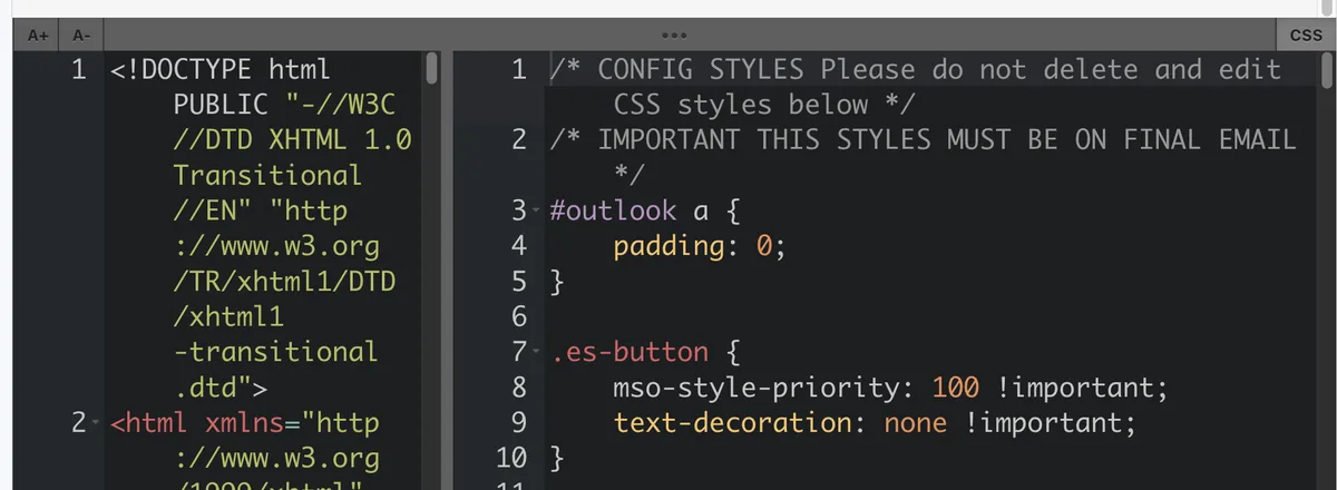
The CSS Editor allows you to manage styles for your HTML content and is accessible via a button in the top-right corner of the code editor.
Important Considerations:
- Limited Support: Many email clients do not support advanced CSS features like Flexbox, Grid, or media queries.
- Stick to Basics: Use basic inline CSS for maximum compatibility.
- Pre-Configured Styles: Avoid deleting pre-configured styles, as they ensure proper rendering across major email clients.
5. Email Client Compatibility
Email HTML requires special attention due to outdated rendering engines in many email clients.
Key Guidelines:
- Use table-based layouts instead of
<div>-based layouts for better support. - Avoid advanced CSS features like animations, Flexbox, or Grid.
- Expect inconsistent behavior for media queries and minor CSS properties.
- Testing: Always test emails in multiple clients (e.g., Gmail, Outlook, Apple Mail) to ensure proper rendering.
6. Padding
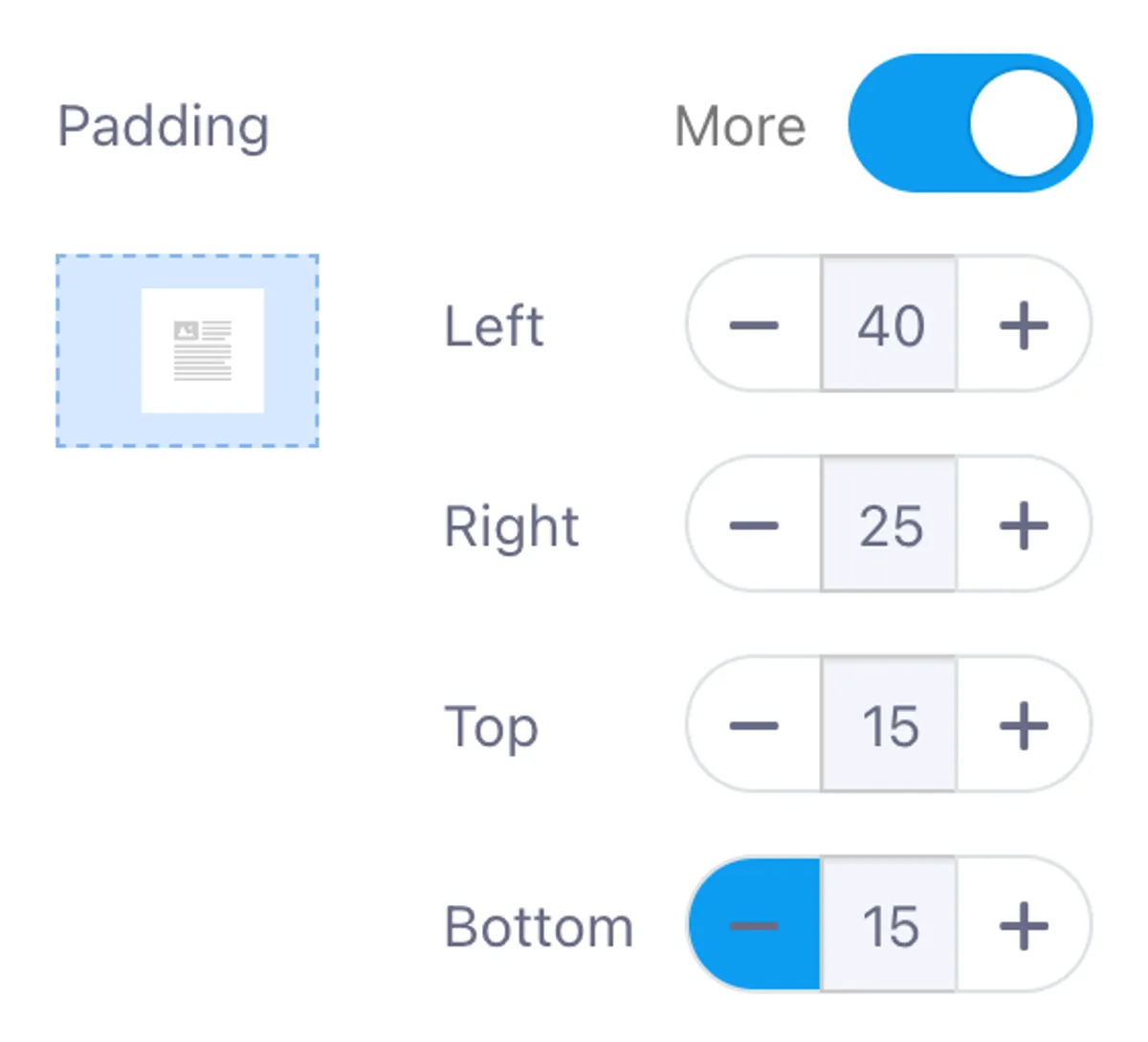
The Padding setting adjusts the space around your HTML content:
- Default Padding: Set to 0 by default.
- Custom Padding: Enable the More toggle to adjust individual padding for:
- Top
- Right
- Bottom
- Left
This feature is ideal for aligning HTML content within the email layout.
7. Add Anchor Link
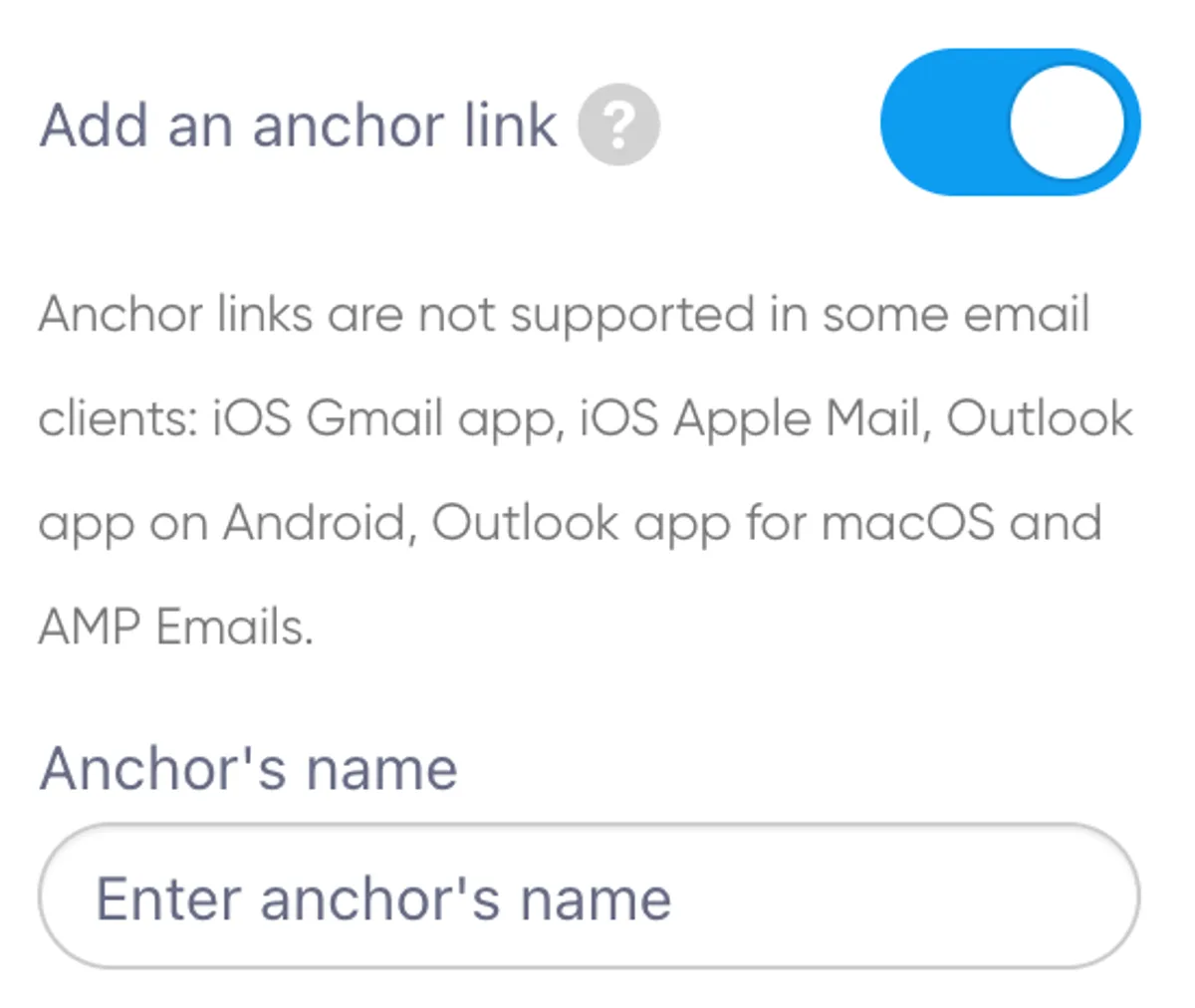
The Add Anchor Link feature allows you to create a clickable link elsewhere in the email that navigates to the HTML Block.
How to Use:
- Toggle the option and enter an anchor name in the field.
Limitations:
- Anchor links are not supported by some email clients, such as:
- iOS Gmail app
- iOS Apple Mail
- Outlook app (Android and macOS)
- AMP Emails
8. Writing Custom HTML
The HTML Editor is designed for writing or pasting your email's custom HTML structure.
Best Practices:
- Use simple, widely-supported HTML.
- Avoid complex layouts or features such as
<div>elements. - Stick to table-based designs to ensure better compatibility.
9. Tips for Success
- Start Small: Use the HTML Block for specific sections if you're new to email development.
- Validate Code: Ensure your HTML complies with email client requirements.
- Test Thoroughly: Use tools to preview and test your email across multiple clients and devices.
Ready to Send Better Emails?
Stop juggling bloated tools or overpriced plans. Maildroppa offers personal support, privacy-conscious controls, and powerful email marketing - starting free forever.
No credit card required. No time limit.