Appearance Tab
Published: December 23, 2024
The Appearance Tab allows you to control the global styling of your email, such as fonts, background colors, button styles, and mobile-specific formatting. This ensures consistency and adaptability across devices and email clients.
Below is a detailed explanation of each section within the Appearance Tab.
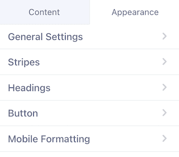
1. General Settings
Customize the overall appearance and alignment of your email. These settings are applied globally across all sections.
- Message Alignment: Align the email content to the Left, Center, or Right.

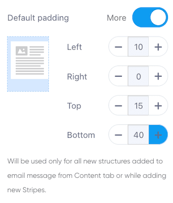
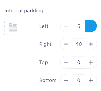
- Default Padding: Set uniform spacing around new structures or adjust padding for each side (Top, Right, Bottom, Left) individually.

- General Background Color: Set the background color of the email using a hex code or color picker.

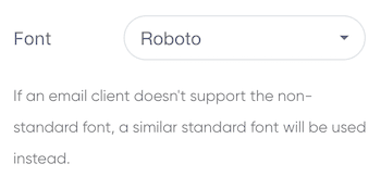
- Font: Choose from standard fonts like Arial, Helvetica, or decorative fonts like Roboto and Lato.

- Line Spacing: Adjust the spacing between lines with four predefined options.

- Paragraph Bottom Space: Enable or disable spacing between paragraphs.

- Underline Links: Automatically underline all links in your email (toggle on/off).

- Responsive Design: Enable to ensure your email adapts to different screen sizes, especially for mobile devices.

- RTL Text Direction: Activate for languages like Arabic or Hebrew.

- Background Image: Add a background image with the option to link it. Drag and drop to upload images.

2. Stripes
Stripes represent large structural sections of your email (e.g., Header, Content, Footer, Info Area). Each stripe can be styled independently.
Header Stripe
- Text Size: Customize the size of header text (8–72).

- Background Color: Set a solid background color or leave it transparent.

- Content Background Color: Adjust the background color within the header section.

- Font Color: Define text color.

- Link Color: Set the color for navigation or other header links.

- Background Image: Add an optional background image.

Content Stripe
The main body of your email for text, images, and interactive elements.
- Text Size: Adjust content text size (8–72).

- Content Background Color: Define the background color of the main content area.

- Font Color: Set the default color of text.

- Link Color: Customize the link color.

Footer Stripe
Typically used for contact details, legal information, or social links.
- Text Size: Set the text size (8–72).

- Background Color: Choose a solid background or leave it transparent.

- Content Background Color: Define the footer’s inner background.

- Font Color: Set the font color.

- Link Color: Customize link color for footer links.

- Background Image: Optionally add an image with a clickable link.

Info Area Stripe
Used for disclaimers, legal notices, or additional information.
- Text Size: Define the font size (8–72).

- Font Color: Set the font color.

- Link Color: Adjust link colors in this stripe.

3. Headings
Define the visual style of headings (H1, H2, H3) for hierarchy and structure in your email.
- Font: Choose a font for headings.

- Line Spacing: Adjust spacing between lines for readability.

- Heading Size: Customize the size of H1, H2, and H3 headings (8–72).
- Text Styling: Apply Bold or Italic styles.
- Font Color: Set a unique color for each heading type.

4. Button
Design the buttons in your email for better engagement.
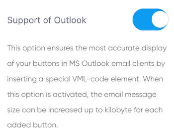
- Support for Outlook: Enable to ensure proper rendering in Microsoft Outlook using VML code (may increase email size).

- Button Color: Set the default color of buttons.

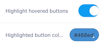
- Highlight Hovered Buttons: Toggle to enable a hover color effect.
- Hover Color: Choose the hover color.

- Font Color: Define the color of button text.

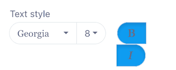
- Text Style:
- Font: Select a font for button text.
- Font Size: Adjust text size (8–72).
- Styling: Apply Bold or Italic text styles.

- Border Radius: Round the corners of buttons (0–100).

5. Mobile Formatting
Ensure your email looks great on mobile devices with mobile-specific settings.
- Header, Content, Footer, Info Area Text Sizes: Customize text sizes for each section on mobile.

- Menu Items Font Size: Adjust font size for navigation menu items.

- Heading Sizes: Set H1, H2, and H3 sizes for mobile view.
- Heading Alignment: Align headings (Left, Center, Right).

- Button Text Size: Customize button text size for mobile.

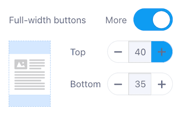
- Full-width Buttons: Enable buttons to span the entire screen width.
- Top and Bottom Padding: Adjust padding for a better mobile appearance.

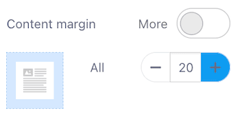
- Content Margin: Adjust margin around content for mobile (0–100).

Final Notes
- Testing: Always test your email across devices and email clients to ensure consistency.
- Accessibility: Use accessible fonts, proper heading structure, and alternate text for images to ensure inclusivity.
- Optimization: Minimize file sizes for faster loading and better performance, especially important for mobile users.

