Contents
the email tool that makes email marketing simple
Email Sign Up Forms: Quick Tips for Better Results
Published: December 23, 2024
Email sign up forms are essential for any email marketing strategy. They are the first step in building your email list, crucial for connecting with customers and growing your business. This article will guide you through creating effective sign up forms. We'll look at different types, from a simple email sign-up to comprehensive email signup forms. We'll discuss how to design forms that encourage more signups and cover essential topics like double opt-in. Whether you're looking to enhance your current forms or build new ones from scratch, you'll find practical advice and real form examples here to help you succeed.
Next, we'll focus on what makes a newsletter signup form work well. Knowing these key points can turn your forms into more than just a way to get emails; they can become a strong part of your strategy to engage customers and grow your email list.
Essentials of Effective Email Sign Up Forms
An effective subscription form is key for lead generation. It's straightforward and user-friendly. A clear title like 'Join Our Weekly Tech Newsletter' instantly informs users about what they're signing up for. Avoid vague titles like 'Subscribe for Updates', which don't specify the content type or frequency.
When it comes to the form fields, limit them to what's essential. For instance, a good form might just ask for 'Email Address' and 'First Name'. In contrast, a form that also asks for a phone number, address, or job title might be too intrusive and deter potential subscribers.
Design-wise, the HTML form should be visually distinct yet harmonious with your site’s layout. A good example is a form with a white background on a webpage with a dark theme, featuring a prominent 'Subscribe' button in a contrasting color like blue or green. A less effective design would be a form that blends into the background, making it hard to spot, with a 'Submit' button in a muted color that doesn't stand out.
The call-to-action button wording is also critical. 'Get Weekly Tech Tips' is more compelling and specific than a generic 'Submit.'
With these essentials in mind, creating a form that's both inviting and respectful of user preferences becomes achievable. Let's now consider how to gather essential information while maintaining a smooth and enjoyable experience for the user, ensuring that your email sign up forms gather what you need without becoming a hurdle for your audience.
Balancing Data Collection with User Experience
When designing an email subscription form, finding the right balance between collecting useful data and not overwhelming your users is key. It's about getting the information you need while keeping the process easy for those signing up.
Start with the basics. Always include a field for the 'Email Address' as it's essential for any email campaign. Then, think about what additional information could be helpful. For instance, adding a 'First Name' field allows for personalized emails, which can make your communications more engaging.
However, be cautious with how much you ask for. A form that requires details like phone numbers, postal addresses, or job titles can feel intrusive and may deter people from signing up. Stick to what’s necessary for your immediate marketing needs.
Also, consider the timing of your questions. Sometimes, it's better to ask for extra information later. For example, once someone subscribes, you can send a welcome email that invites them to share more about their preferences or interests. This two-step approach feels less demanding and gives users control over the information they share.
Remember, the simpler the form, the better the user experience. A clean, straightforward form with two or three fields is often all you need to start building a meaningful connection with your subscribers.
Next, let’s look into how to effectively and responsibly handle the information you collect, ensuring that your email list sign up forms not only meet your business needs but also respect user privacy and legal requirements.
Navigating GDPR Compliance in Email Sign Up Forms
Understanding and adhering to GDPR (General Data Protection Regulation) is crucial when creating signup forms, especially if you have subscribers from the European Union. GDPR is all about protecting personal data and privacy, ensuring that people know what they're signing up for and how their information will be used.
Firstly, make sure your form includes clear consent checkboxes – not pre-ticked ones. For instance, you could have a checkbox saying, “Yes, I agree to receive the weekly newsletter and understand I can unsubscribe at any time.” This makes it transparent that they’re opting into specific communications.
Also, include a straightforward link to your privacy policy, explaining how you handle subscriber data. This could be a simple line below your sign-up button saying, “Read our privacy policy here,” linking to a page that details how you manage and protect user data.
Remember, under GDPR, subscribers have the right to access their data and request its deletion. Ensure your email platform can handle these requests efficiently.
Lastly, if you’re offering different types of emails (like newsletters, product updates, etc.), consider separate checkboxes for each. This gives subscribers control over what they receive and ensures you’re compliant with GDPR’s specificity requirements.
With GDPR compliance in place, your subscribers can trust that their data is handled with care, enhancing your brand’s reputation. Next, we’ll explore how to analyze and refine your signup form based on user interactions and feedback, ensuring it remains effective and user-friendly.
Analyzing and Improving Form Performance
To ensure your email signup form is effective, regular analysis and improvement are key. Start by checking basic metrics such as the number of sign-ups (conversions) and how many people saw the form (views). A crucial metric here is the conversion rate, calculated by dividing the number of sign-ups by the number of views. For example, if your form was viewed 100 times and got 10 sign-ups, your conversion rate is 10%.
If your form’s conversion rate is lower than expected, consider making some changes. Simple adjustments can often lead to better performance. For instance, if your form is long and complex, try reducing the number of fields. Ask only for essential information like email addresses initially, and more details later.
The design of your form can also affect its performance. If it's not visually appealing or hard to find on your website, users might overlook it. Try changing the form’s color to make it stand out more or move it to a more prominent spot on your webpage.
A/B testing is another effective way to improve your form. This involves creating two versions of your form with one difference between them, such as the wording of the CTA button or the color scheme. By comparing the performance of these versions, you can see which works better and make informed decisions about design and content.
Remember, improving an email signup form is an ongoing process. Regularly check its performance and be ready to tweak and test different elements.
As we understand the importance of a well-performing newsletter signup form, let's move towards learning how specific tools and platforms, like Maildroppa, can make this process easier and more efficient, offering features tailored to enhance your form's performance.
Introducing Maildroppa’s Signup Form Capabilities
Maildroppa's sign-up form builder is notably user-friendly, providing a straightforward way to craft sign-up forms that are both appealing and effective. Let's see how it works.
The builder offers three types of forms, each suited for different website areas and user interactions. The Slider Signup Form is subtle; it appears at the edge of the page and gradually opens. This design is great for catching attention without being too intrusive, ideal for sites where user experience is key.
Then there's the Page Inline Form, which is more static. You can place it anywhere on your webpage, like the top right corner, where it's always visible. This form works well at the bottom of articles or under popular content, leveraging reader engagement for higher sign-up rates.
The Popup Form is more direct. It appears in the middle of your page after a short delay. Despite being the most assertive, it's effective for conversions. There's also a customizable option where the popup is triggered by a user action, like clicking an image icon. This method combines low intrusion with the visibility of a popup, offering the best of both worlds.
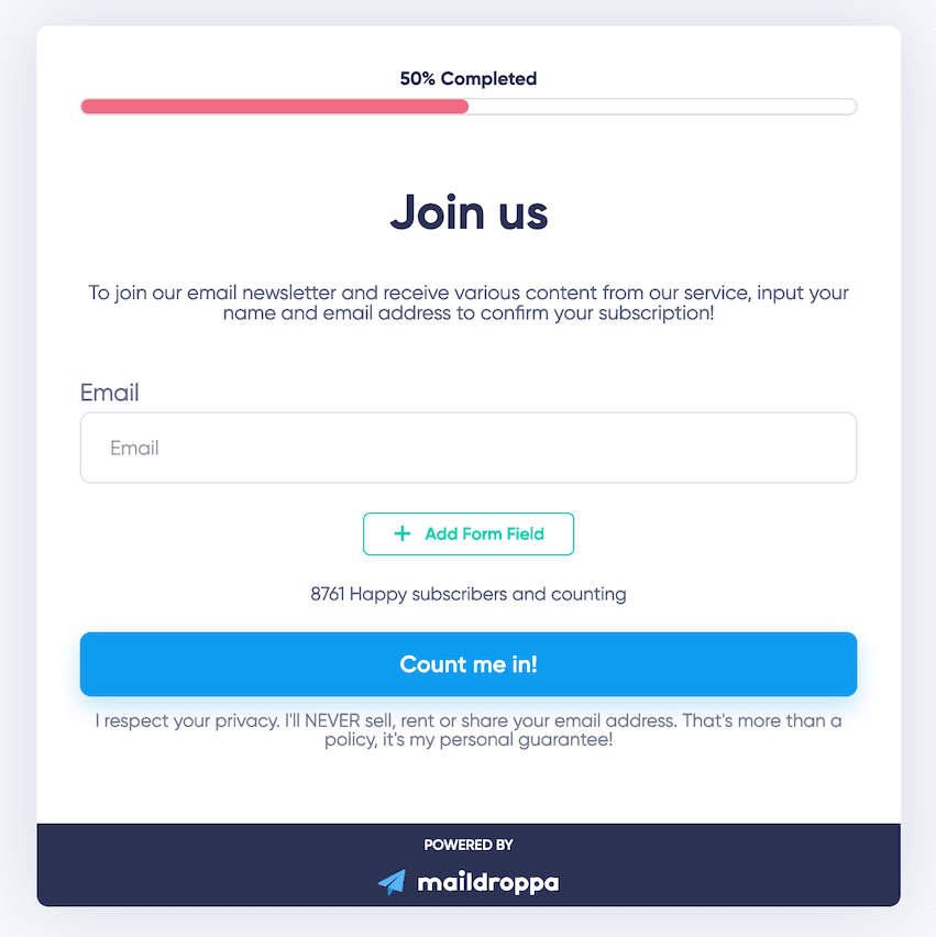
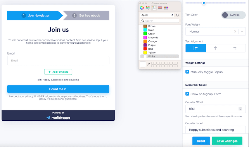
Beyond these types, Maildroppa enhances form effectiveness with additional features. The progress bar , available in two styles, taps into users' desire for completion and order. It visually indicates how far they are in the sign-up process, encouraging them to finish.
The subscriber counter is an excellent example of using social proof. Displaying the number of subscribers can instill trust in new visitors, especially when those numbers are high. For newer sites, Maildroppa's offset number feature can help avoid the potential trust issues of low subscriber counts.
Lastly, the footer disclaimer helps build trust by assuring visitors of their privacy and data security . This simple addition can significantly increase a form's conversion rate.
With Maildroppa's form builder, creating customized sign-up forms is simple and effective. Now, let's see how Maildroppa also ensures these forms meet GDPR regulations for complete compliance.
Ensuring Compliance with Maildroppa
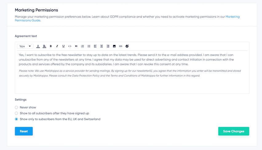
Maildroppa offers a comprehensive suite of features designed to enhance your email newsletter signup forms and ensure they meet GDPR regulations, essential for businesses in or targeting the European Union. At the forefront of these features is the Marketing Permissions page, where you can customize your data processing agreement. This crucial tool allows you to outline how subscriber data is handled and stored, ensuring compliance with data protection laws.
The platform includes an Agreement Text Editor that provides enhanced customization capabilities. Here, you can not only modify and translate the agreement text but also add links to your privacy policy. This step is vital for providing clear information about your data handling practices, reinforcing transparency and trust with your subscribers.
Maildroppa also focuses on informed consent mechanisms. The platform enables the inclusion of detailed consent clauses in the signup process. These clauses inform subscribers about their rights regarding data usage, including the ability to unsubscribe at any time and understand how their data is used for direct marketing purposes.
Flexibility in displaying GDPR consent forms is another key aspect of Maildroppa's compliance features. You have the option to set these forms to appear always, never, or only for subscribers from specific regions like the EU, UK, and Switzerland. This adaptability allows you to balance legal compliance with a streamlined user experience.
Additionally, Maildroppa enforces a mandatory double opt-in process for all customers. This process goes beyond mere compliance; it significantly improves your email sender reputation score, resulting in higher email delivery rates. More of your emails will reach customers' inboxes, enhancing overall engagement and effectiveness of your email campaigns.
After understanding Maildroppa's commitment to legal compliance and trust-building features, let's now learn how to actually create these forms using Maildroppa's builder.
Creating Forms with Maildroppa’s Builder
Creating forms with Maildroppa’s builder is straightforward and user-friendly. Here's an overview of the process, keeping in mind the form types we discussed earlier.
First, choose the form type that suits your needs. Each type serves a specific purpose. For example, the pop-up form is excellent for quickly capturing the attention of visitors, while sliders and embedded forms provide alternative engagement methods.
Next is customization. Once you've selected a form type, you can tailor its design to match your website's style. This step involves adjusting colors, fonts, and layouts to ensure the form integrates well with your site’s aesthetic, be it minimalist or more elaborate.
Besides the email address, you can include fields like first or last name for personalization. The aim is to collect necessary information while keeping the form user-friendly and engaging.
GDPR compliance is managed on the Marketing Permissions page. This is where you customize your data processing agreement to ensure your forms comply with GDPR standards.
The final step is to finalize and test your form. Previewing it allows you to check its appearance and functionality, and testing it on your site ensures everything works as it should.
Moreover, Maildroppa’s Form Settings page enables you to customize the text for the entire sign-up lifecycle. This includes customizing the signup confirmation email, a key part of the double opt-in process Maildroppa requires for GDPR compliance and improved email campaign metrics.
In essence, Maildroppa’s form builder simplifies creating and managing sign-up forms, ensuring a seamless experience for both you and your subscribers, while maintaining compliance and effectiveness.
How to Convert New Leads into Loyal Customers
Once a user signs up through your Maildroppa form, the journey towards building a lasting relationship begins. Engaging them effectively becomes crucial, and Maildroppa offers a suite of tools to help you maintain and deepen this connection.
Use Segmentation and Automated Emails Effectively
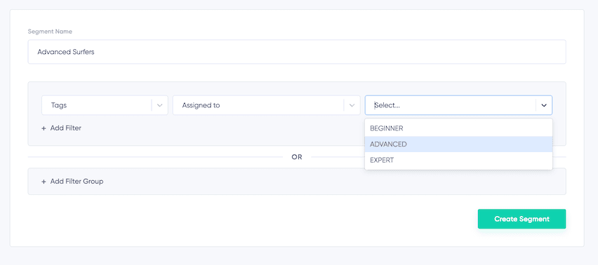
Segmentation in Maildroppa lets you divide your email list into distinct groups based on shared characteristics like interests or past behaviors. This approach allows you to tailor your newsletter campaigns to the specific needs and preferences of each subgroup. For instance, new subscribers interested in your email course might receive different content than long-standing customers. This targeted approach not only makes your emails more relevant to each subscriber but also significantly boosts engagement and conversion rates. Learn more about effectively using segmentation in our detailed guide.
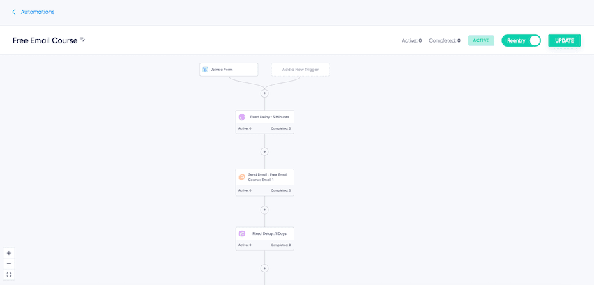
Email automation takes this a step further. With Maildroppa, you can set up drip campaigns or welcome series, sending a sequence of emails over time. This method is perfect for gradually introducing new subscribers to your brand or providing educational content in digestible segments. Moreover, you can leverage Maildroppa's conditional checks and follow-up content based on subscriber tags to ensure each message is as relevant as possible. For example, if a subscriber shows interest in a specific product, they can automatically receive follow-up emails related to that interest. Explore our comprehensive tutorial on setting up email automations.
Personalize Your Emails for Better Engagement
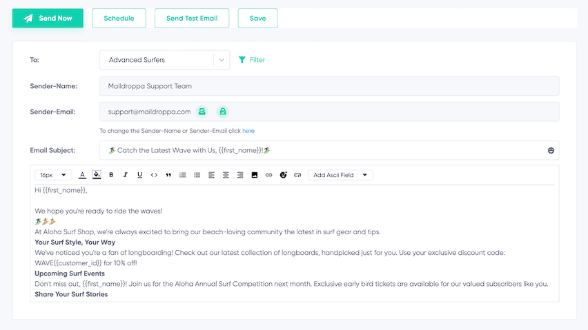
Personalization is a key driver in maintaining subscriber interest. Addressing subscribers by their first name or tailoring content based on their preferences makes each communication feel more personal and engaging. Regular updates and newsletters, combined with occasional mentions or links to your social media content, help keep your brand at the forefront of your audience's minds.
Maildroppa's platform also simplifies sending out event reminders or celebrating personal milestones like birthdays and subscription anniversaries. These touches of personalization can significantly enhance subscriber loyalty and engagement.
Keep Your Audience Engaged with Regular Updates
Maintaining regular communication is essential to keep your audience engaged. Maildroppa’s platform makes it easy to schedule consistent updates or newsletters. Whether it’s providing weekly insights, monthly product news, or daily briefs, this regular contact helps keep your brand prominent in your audience's mind. Find out how to create and schedule effective newsletter campaigns with Maildroppa.
Track and Improve Email Success
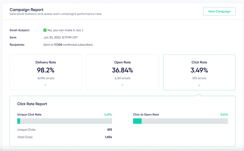
Understanding your audience's preferences and how they interact with your emails is crucial for optimizing engagement. Maildroppa offers tools to track metrics like open rates and click-through rates, giving you valuable insights into what type of content resonates with your audience. This data allows you to continuously refine your strategy for maximum impact. For a more in-depth understanding of these metrics, including details on delivery rates, bounce rates, and more, you can explore our comprehensive article on newsletter campaign reports.
Conclusion
This article has guided you through creating effective email sign up forms and the importance of keeping them user-friendly and compliant with privacy laws. We've looked at how to design forms that encourage sign-ups and ways to analyze their performance for better results.
Here's where Maildroppa comes in. It offers an easy-to-use form builder, helps you follow privacy rules, and has great features for keeping subscribers engaged. With Maildroppa, you can organize your subscribers, automate your emails, and personalize your messages to make them more appealing.
Whether you're looking to improve your current email strategy or starting from scratch, Maildroppa has the right tools for you. It simplifies your email marketing tasks while ensuring you're doing things the right way.
Consider Maildroppa as a partner in your email marketing journey. It's designed to make your campaigns more effective and easier to manage. Try Maildroppa and discover how it can enhance your connection with your audience and help grow your business.


